Design System
Design System
Scalable UI
Scalable UI
Multi Brand
Multi Brand
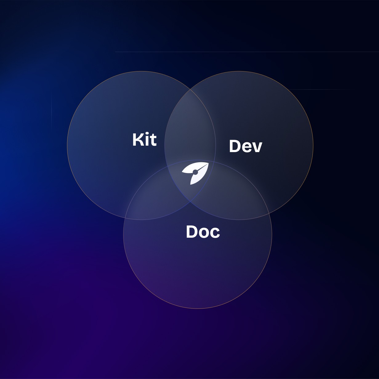
Building Scalable Multi-Brand Design Systems with Figma Variables
Building Scalable Multi-Brand Design Systems with Figma Variables
Building Scalable Multi-Brand Design Systems with Figma Variables
Project Timeline
2023
2023
Industry
Documentation
Documentation
Client
Pupuk Indonesia
Pupuk Indonesia
A scalable and flexible multi-brand design system built to support an expanding product ecosystem through a unified variable-driven structure.
A scalable and flexible multi-brand design system built to support an expanding product ecosystem through a unified variable-driven structure.
As the number of digital products continued to grow within the organization, the need for a unified yet adaptable design foundation became increasingly clear. Each application carried its own stylistic direction and functional demands, making it difficult to maintain consistency and efficiency across teams. Without a structured system, designers and developers often had to rebuild similar components with slight variations, creating unnecessary complexity over time.
As the number of digital products continued to grow within the organization, the need for a unified yet adaptable design foundation became increasingly clear. Each application carried its own stylistic direction and functional demands, making it difficult to maintain consistency and efficiency across teams. Without a structured system, designers and developers often had to rebuild similar components with slight variations, creating unnecessary complexity over time.
To address this, a multi-brand design system was introduced using a variable-based architecture that supports both shared foundations and brand-specific themes. This setup allows new products to be onboarded smoothly while preserving visual distinction where needed. The goal was to create a system that not only standardizes core patterns, but also remains flexible enough to scale with future product requirements.
To address this, a multi-brand design system was introduced using a variable-based architecture that supports both shared foundations and brand-specific themes. This setup allows new products to be onboarded smoothly while preserving visual distinction where needed. The goal was to create a system that not only standardizes core patterns, but also remains flexible enough to scale with future product requirements.

Challenge & Approach
Challenge & Approach
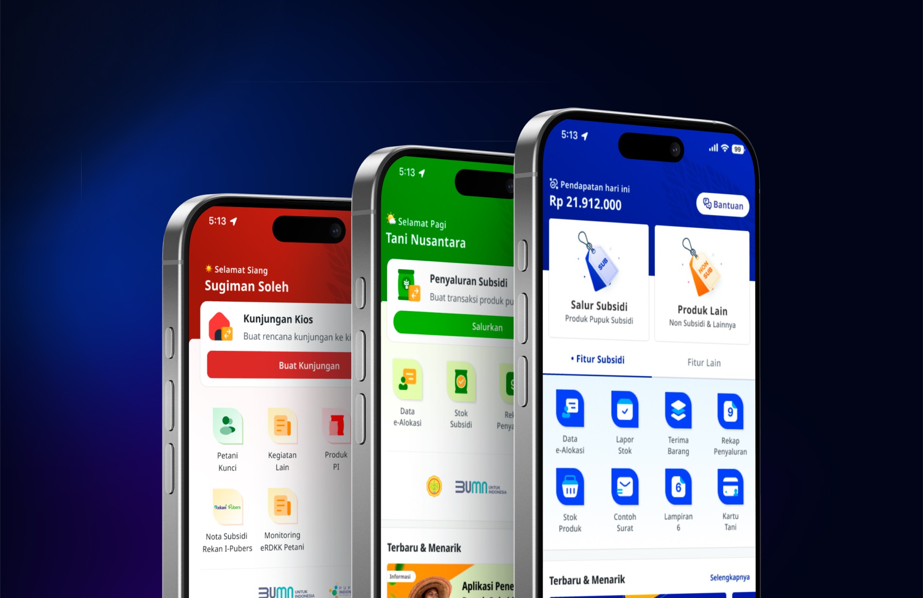
The team was dealing with a growing list of applications developed under different timelines and requirements, which led to noticeable inconsistencies across interfaces. Each product evolved with its own patterns, styles, and component variations, creating fragmentation and additional work whenever updates were needed. Managing multiple standalone design systems was no longer sustainable, especially as new products continued to enter the pipeline.
The team was dealing with a growing list of applications developed under different timelines and requirements, which led to noticeable inconsistencies across interfaces. Each product evolved with its own patterns, styles, and component variations, creating fragmentation and additional work whenever updates were needed. Managing multiple standalone design systems was no longer sustainable, especially as new products continued to enter the pipeline.
To address this, a multi-brand design system was introduced using a variable-based architecture that supports both shared foundations and brand-specific themes. This setup allows new products to be onboarded smoothly while preserving visual distinction where needed. The goal was to create a system that not only standardizes core patterns, but also remains flexible enough to scale with future product requirements.
To address this, a multi-brand design system was introduced using a variable-based architecture that supports both shared foundations and brand-specific themes. This setup allows new products to be onboarded smoothly while preserving visual distinction where needed. The goal was to create a system that not only standardizes core patterns, but also remains flexible enough to scale with future product requirements.
Design Proccess
Design Proccess
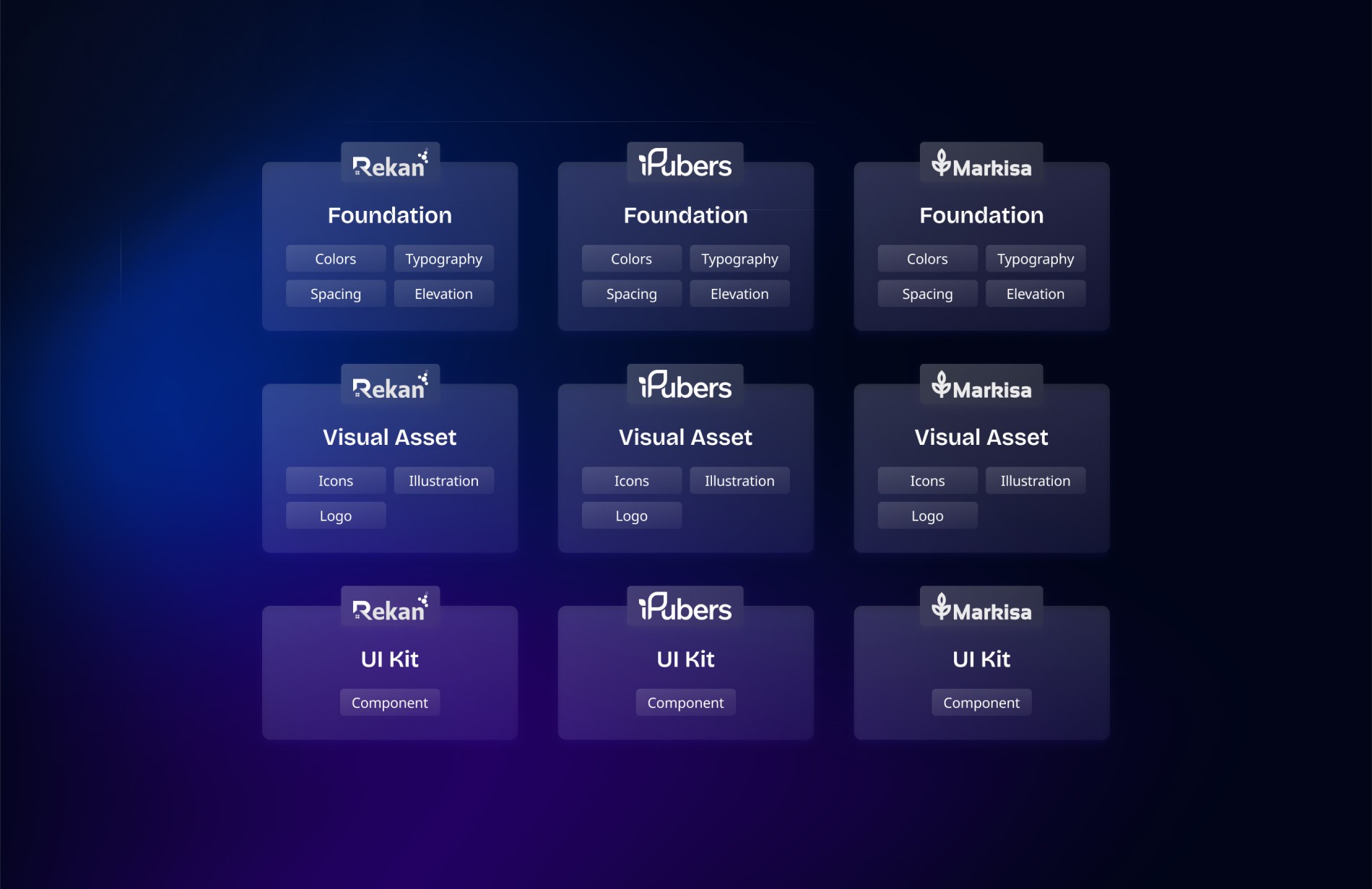
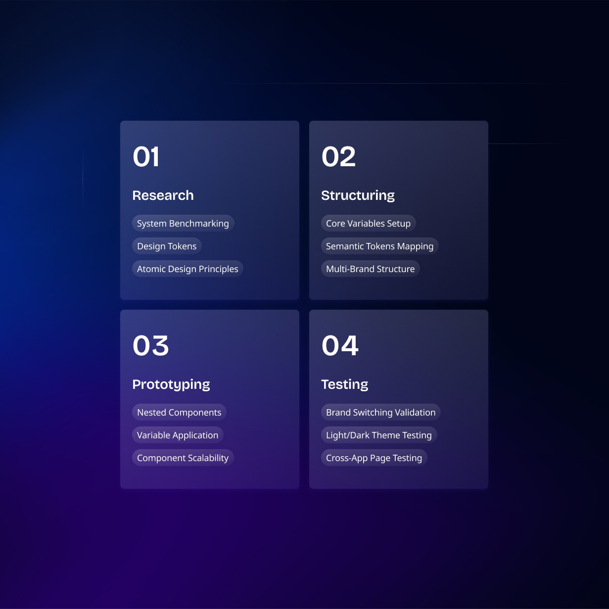
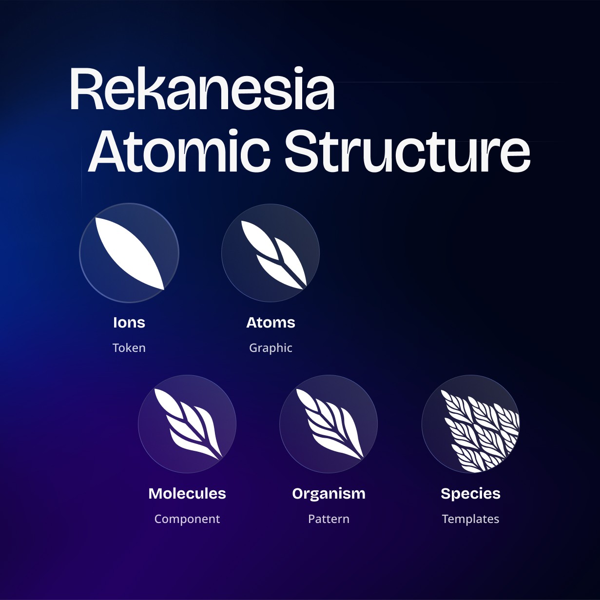
The process began with a deep review of established design systems from leading companies, focusing on how they scale, maintain consistency, and support multiple product identities. Insights from these references guided the decision to adopt design tokens, atomic design structure, and a variable-driven approach as the foundation. This provided a clear framework for organizing colors, typography, spacing, and themes in a way that could flexibly grow with expanding product requirements.
The process began with a deep review of established design systems from leading companies, focusing on how they scale, maintain consistency, and support multiple product identities. Insights from these references guided the decision to adopt design tokens, atomic design structure, and a variable-driven approach as the foundation. This provided a clear framework for organizing colors, typography, spacing, and themes in a way that could flexibly grow with expanding product requirements.
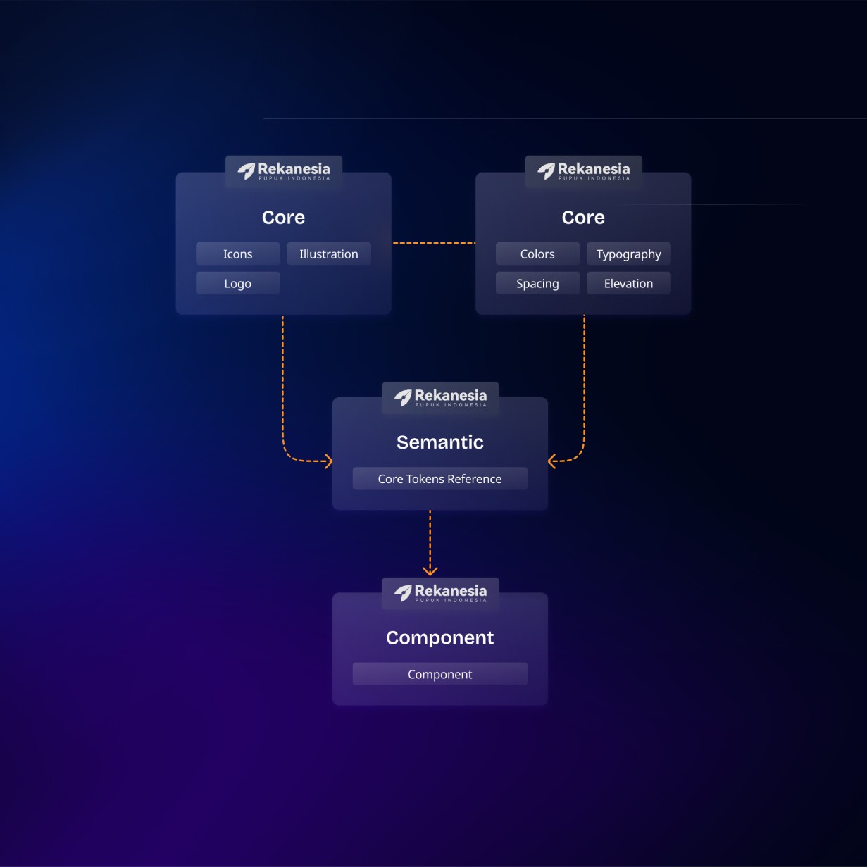
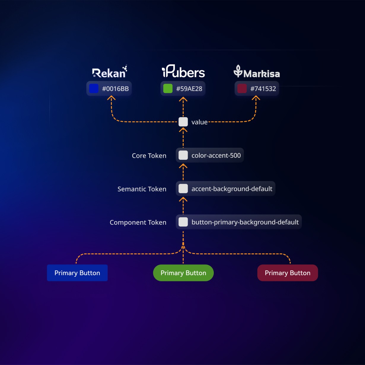
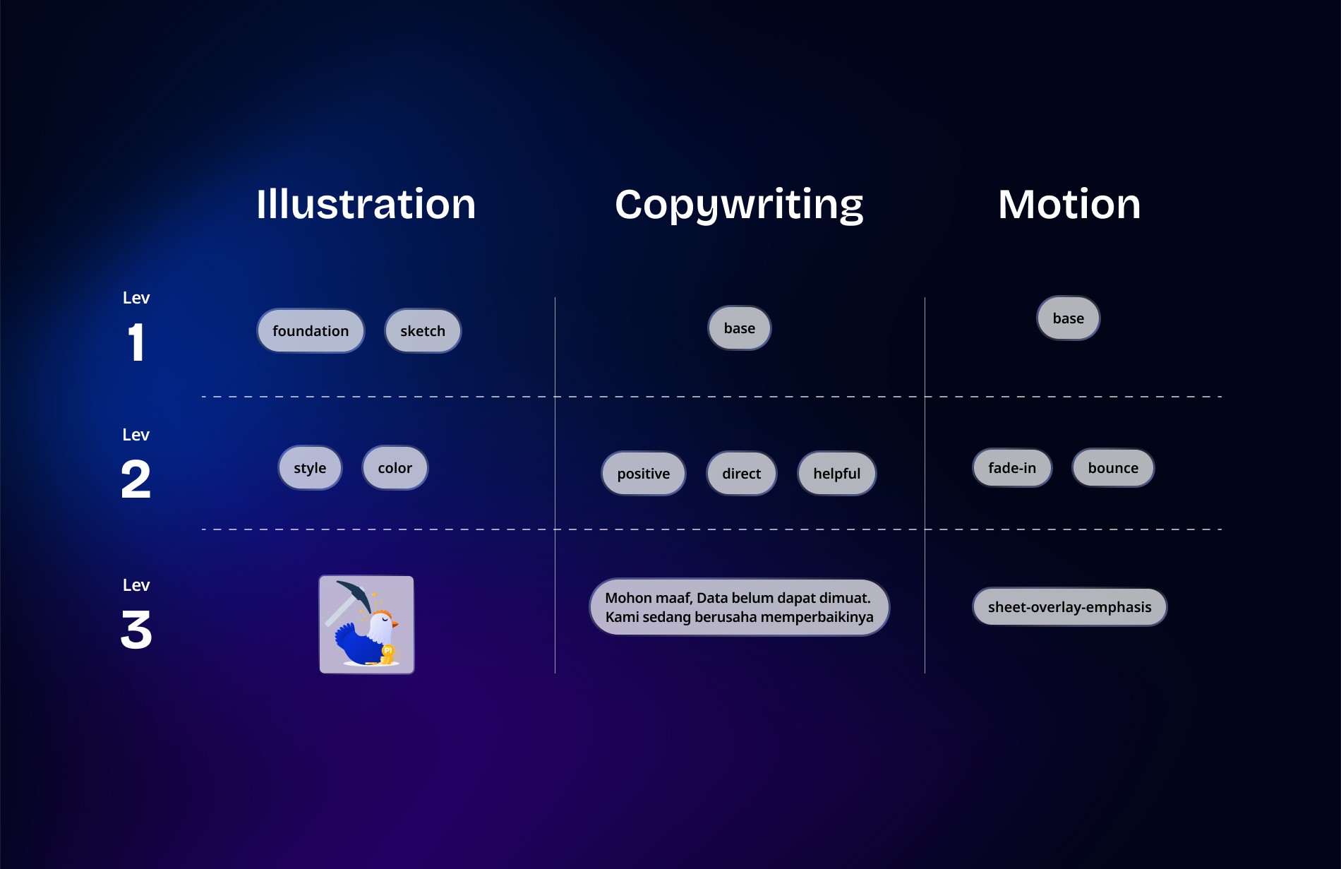
Building on this foundation, the system was structured across layered libraries using Figma Variables to bridge the gap between designers and developers. Core tokens established universal foundations, semantic tokens translated those values into brand-ready mappings, and component libraries integrated both through nested structures. Variables were then applied at the component level to enable instant theme and brand switching. This approach ensured consistency across applications while keeping the system adaptable, scalable, and efficient for long-term use.
Building on this foundation, the system was structured across layered libraries using Figma Variables to bridge the gap between designers and developers. Core tokens established universal foundations, semantic tokens translated those values into brand-ready mappings, and component libraries integrated both through nested structures. Variables were then applied at the component level to enable instant theme and brand switching. This approach ensured consistency across applications while keeping the system adaptable, scalable, and efficient for long-term use.

Outcome
Outcome
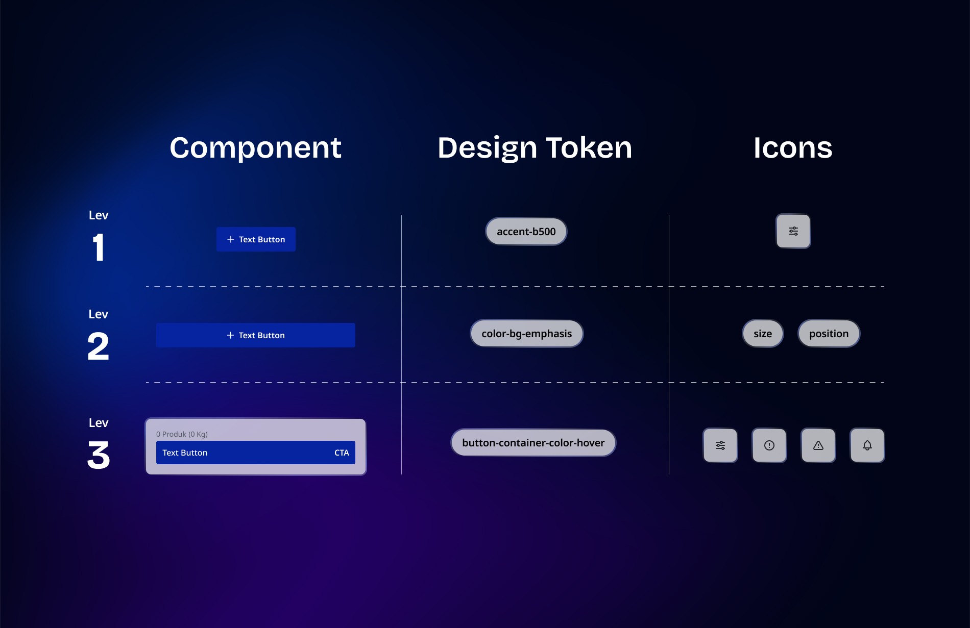
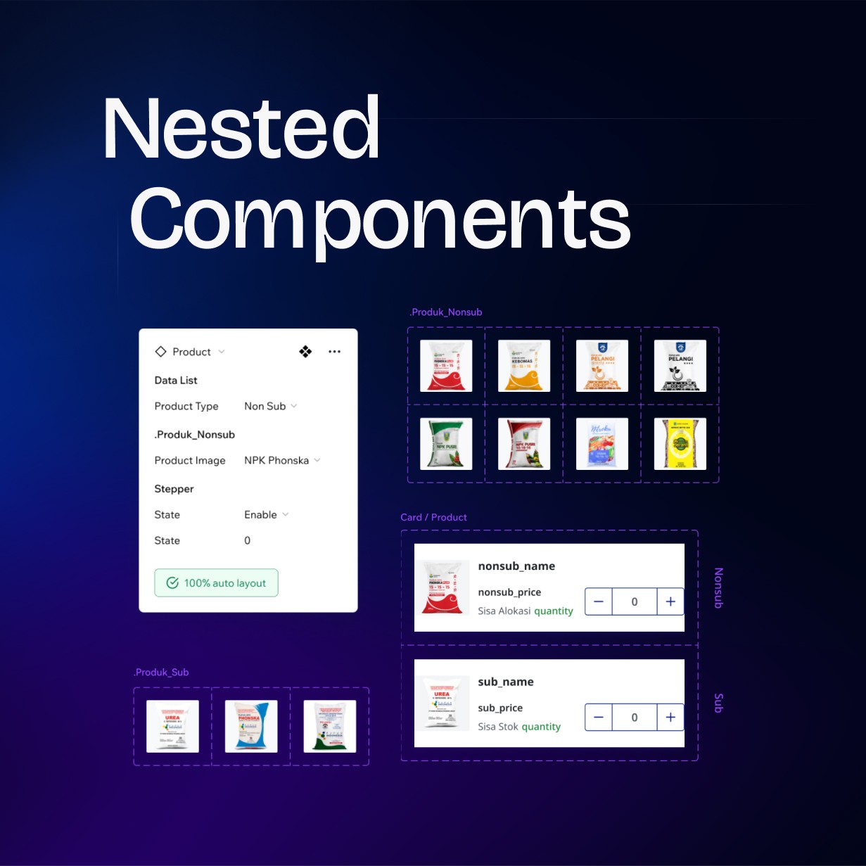
The prototyping phase resulted in a component structure that is significantly more flexible and scalable. By applying a nested architecture, components became easier to extend, modify, and repurpose across multiple design contexts. The addition of variables further strengthened this system, enabling controlled adjustments without disrupting underlying foundations.
The prototyping phase resulted in a component structure that is significantly more flexible and scalable. By applying a nested architecture, components became easier to extend, modify, and repurpose across multiple design contexts. The addition of variables further strengthened this system, enabling controlled adjustments without disrupting underlying foundations.
This approach created a cleaner, more maintainable design environment. Components now follow a predictable structure, making them easier to manage while reducing repetitive setup work. The system is prepared for future expansion and can accommodate new brands or product requirements with minimal rework.
This approach created a cleaner, more maintainable design environment. Components now follow a predictable structure, making them easier to manage while reducing repetitive setup work. The system is prepared for future expansion and can accommodate new brands or product requirements with minimal rework.

Impact
Impact
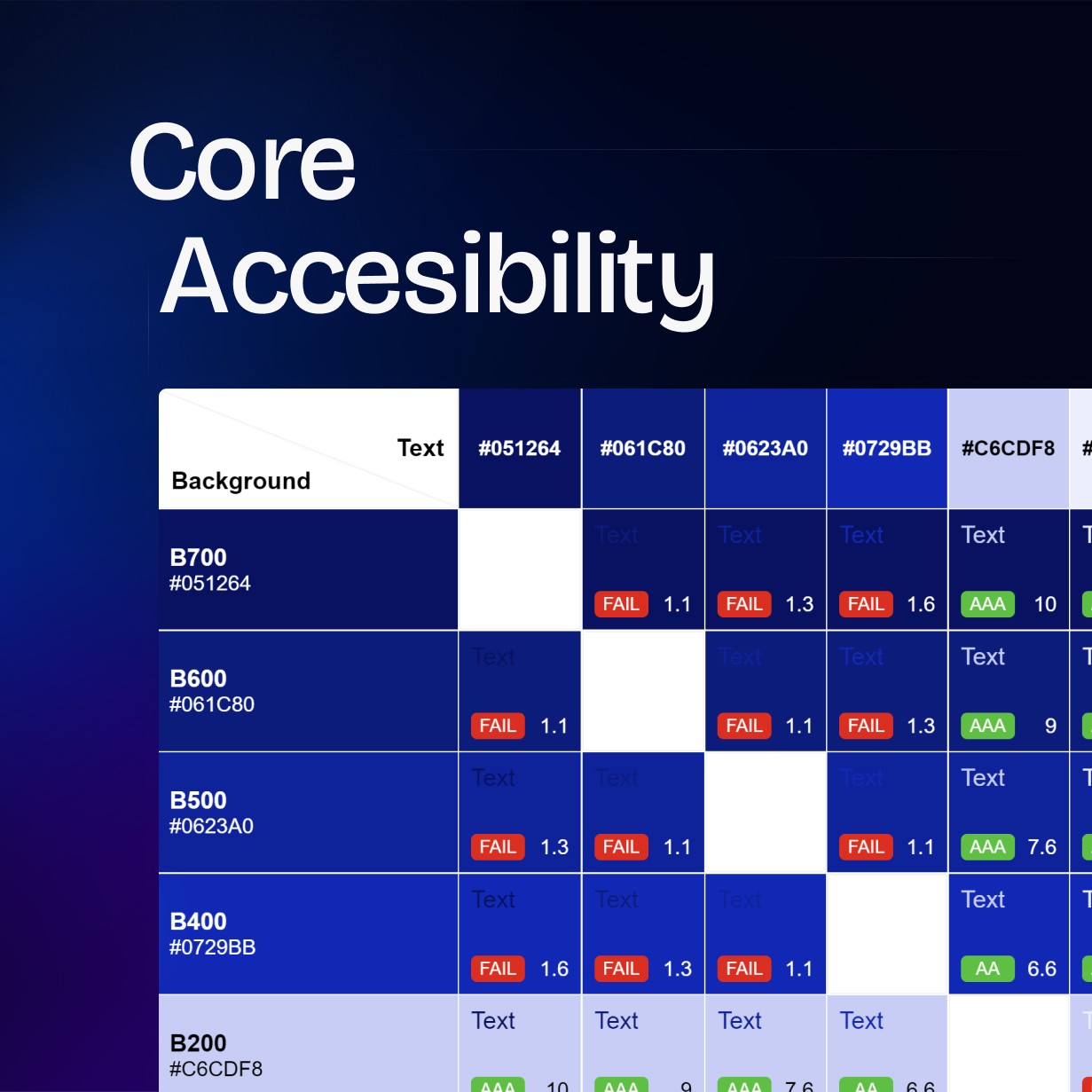
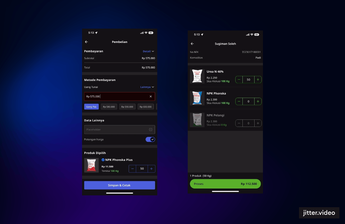
Comprehensive testing demonstrated that the system performs reliably across varied use cases. Components behaved consistently, adapted well to different configurations, and maintained visual and functional stability throughout the evaluation.
Comprehensive testing demonstrated that the system performs reliably across varied use cases. Components behaved consistently, adapted well to different configurations, and maintained visual and functional stability throughout the evaluation.
This level of consistency supports faster workflows for both designers and developers. With fewer inconsistencies and less manual adjustment needed, collaboration becomes smoother and project delivery becomes more efficient. The standardized structure also lays a stronger foundation for scaling future product lines.
This level of consistency supports faster workflows for both designers and developers. With fewer inconsistencies and less manual adjustment needed, collaboration becomes smoother and project delivery becomes more efficient. The standardized structure also lays a stronger foundation for scaling future product lines.
Reflection
Reflection
The development of this multi-brand design system sets the foundation for a more unified and scalable design approach. What began as a solution for managing multiple applications within the Marketing Digitalization unit has grown into a framework capable of supporting long-term expansion and adaptation. Its structure ensures that future brands and applications can be integrated without compromising consistency or efficiency.
The development of this multi-brand design system sets the foundation for a more unified and scalable design approach. What began as a solution for managing multiple applications within the Marketing Digitalization unit has grown into a framework capable of supporting long-term expansion and adaptation. Its structure ensures that future brands and applications can be integrated without compromising consistency or efficiency.
Looking ahead, the system is envisioned to serve as a shared standard across Pupuk Indonesia’s broader digital ecosystem. By strengthening alignment and reducing fragmentation, it encourages a more cohesive experience across products while simplifying maintenance for design and development teams. This direction creates a pathway toward a more connected and sustainable design culture within the organization.
Looking ahead, the system is envisioned to serve as a shared standard across Pupuk Indonesia’s broader digital ecosystem. By strengthening alignment and reducing fragmentation, it encourages a more cohesive experience across products while simplifying maintenance for design and development teams. This direction creates a pathway toward a more connected and sustainable design culture within the organization.