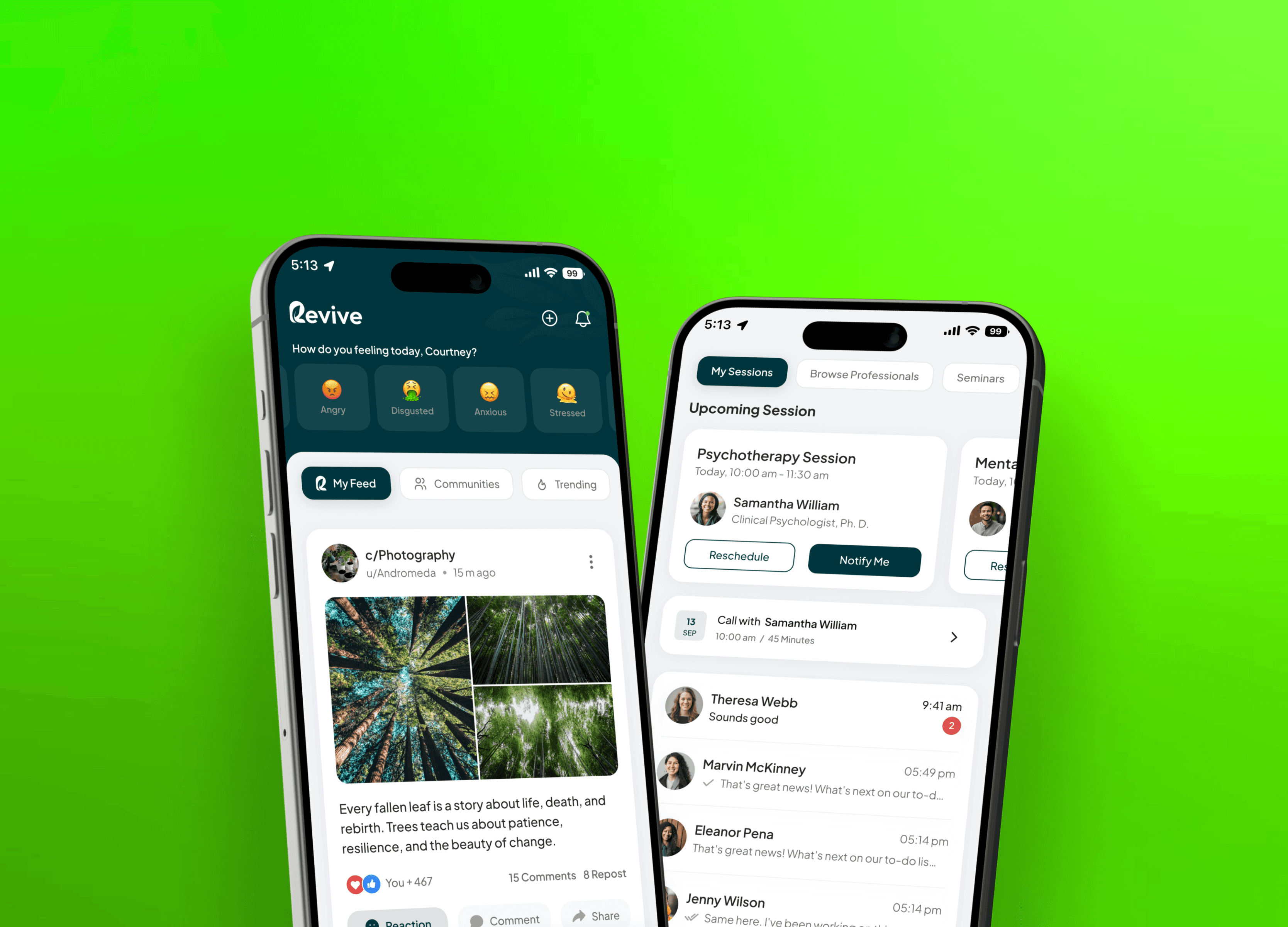
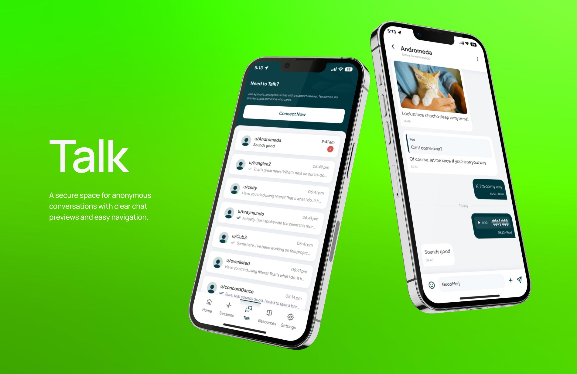
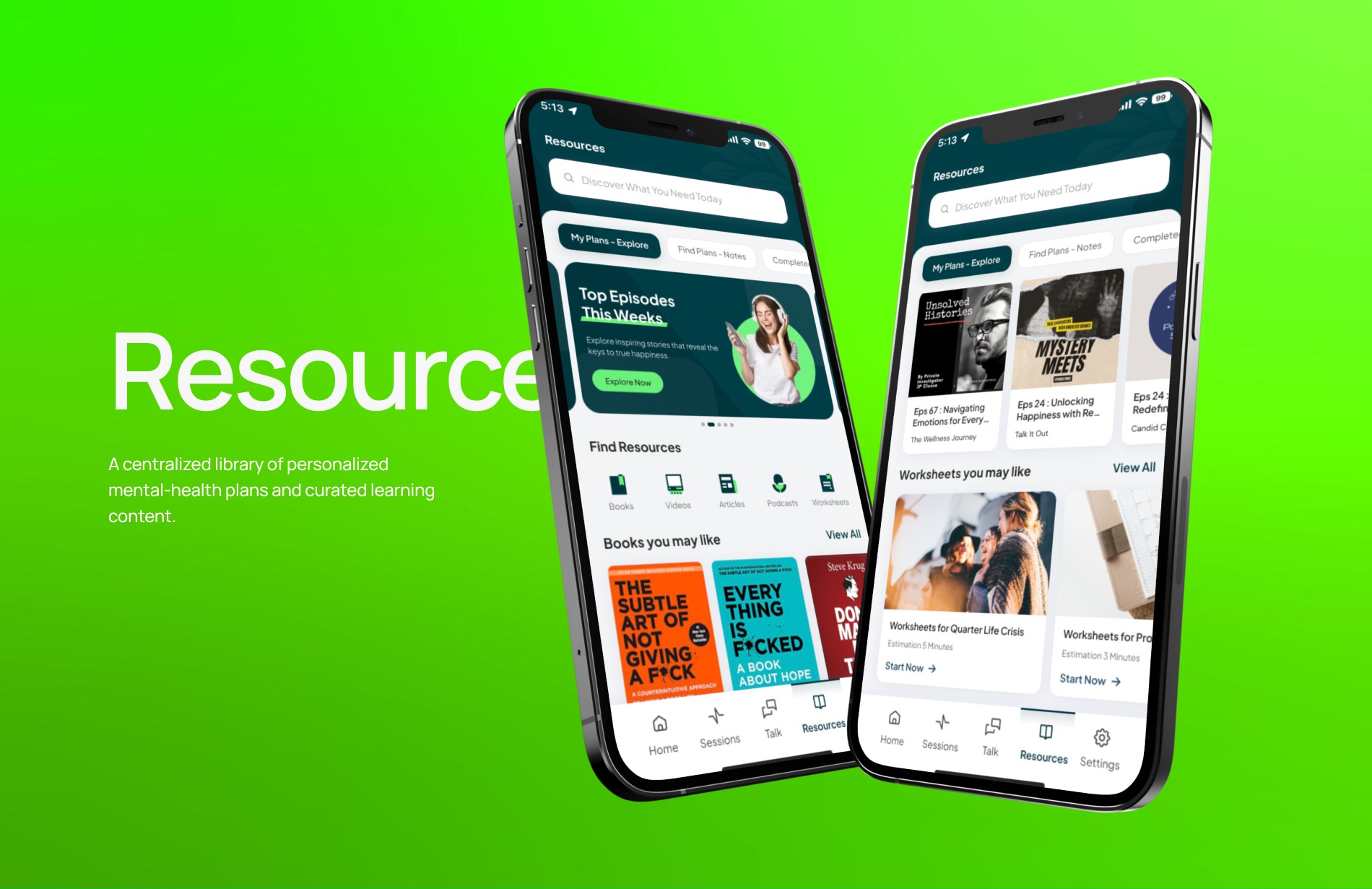
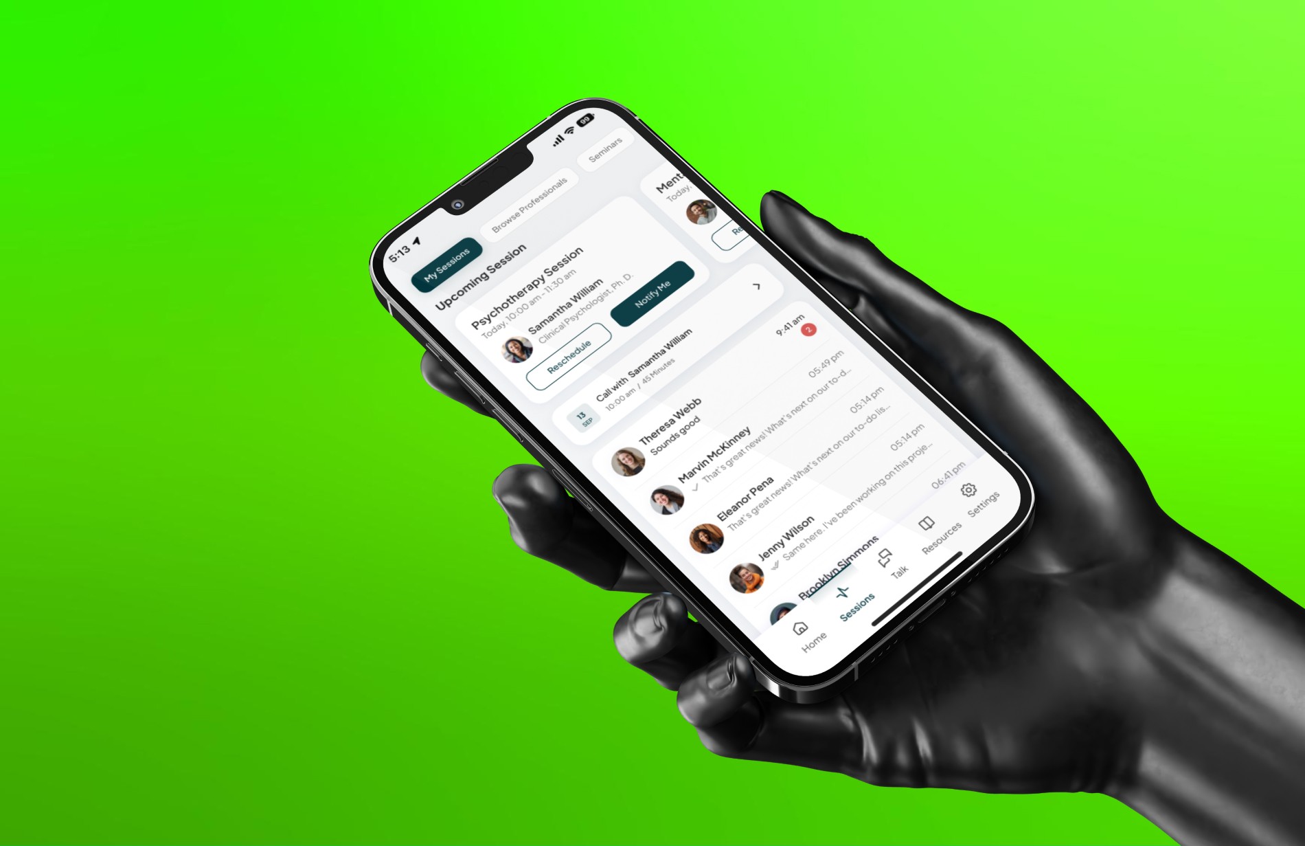
Mobile App
Mobile App
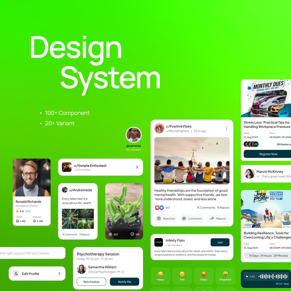
Interaction Design
Interaction Design
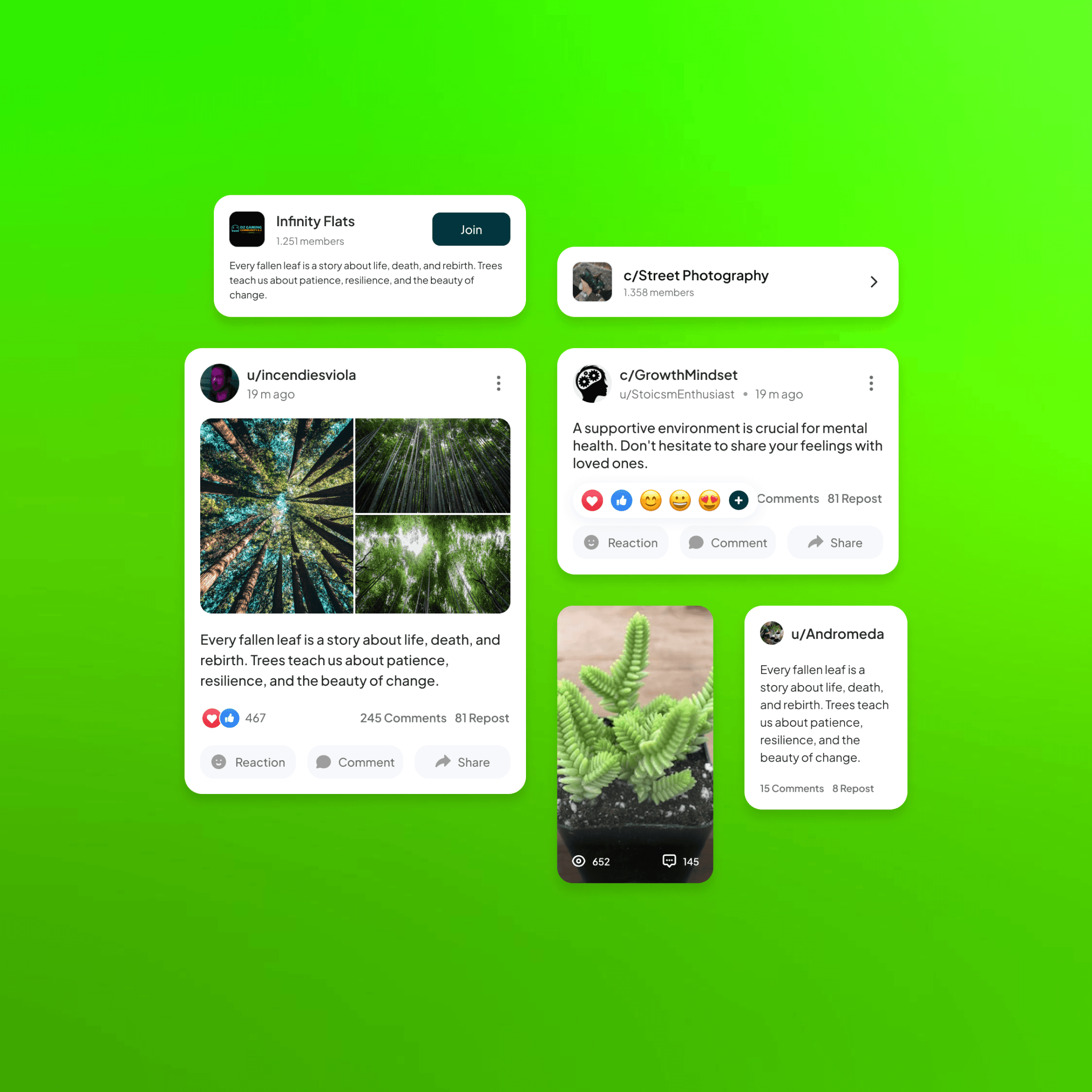
Community Design
Community Design
A Safe and Seamless Experience for Navigating Mental Health Support
A Safe and Seamless Experience for Navigating Mental Health Support
A Safe and Seamless Experience for Navigating Mental Health Support
Project Timeline
2024
2024
Industry
Mental Health
Mental Health
Client
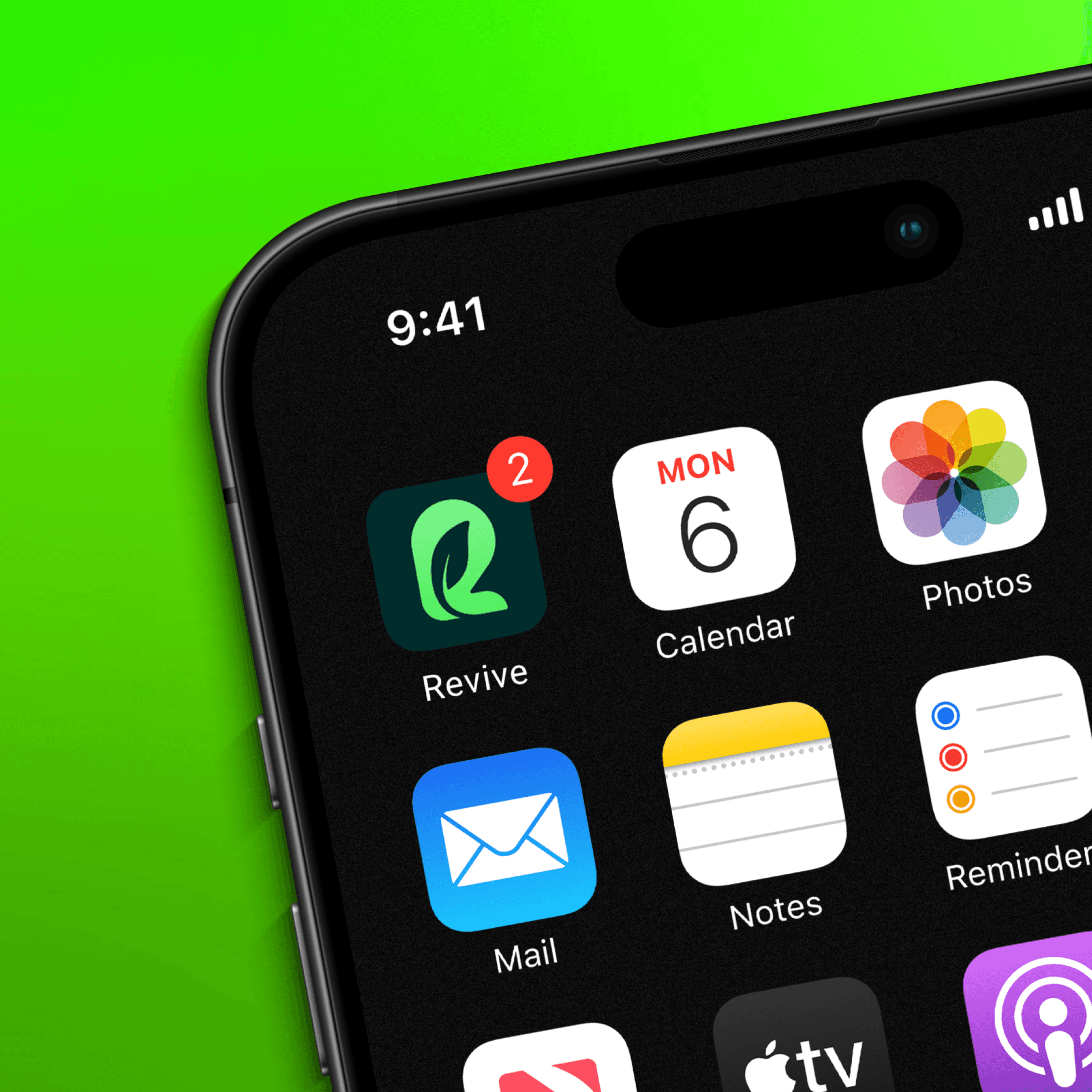
Revive
Revive
Website
Making mental health care feel approachable and personal by bringing guidance, support, and access to professional help into one place that feels safe
Making mental health care feel approachable and personal by bringing guidance, support, and access to professional help into one place that feels safe
Mental health support often feels fragmented and overwhelming, especially when people are unsure where to begin. This project focuses on simplifying that experience through a thoughtful digital platform that connects users with the right resources in a safe and reassuring way.
Mental health support often feels fragmented and overwhelming, especially when people are unsure where to begin. This project focuses on simplifying that experience through a thoughtful digital platform that connects users with the right resources in a safe and reassuring way.
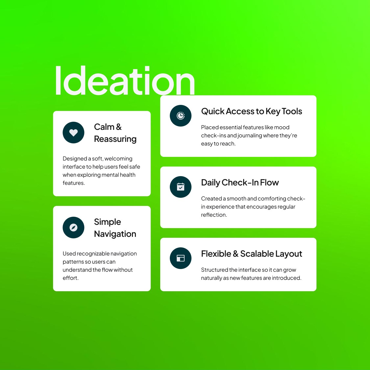
At its core, Revive focuses on human connection. Every interaction, visual, and flow was designed to make people feel understood, not analyzed and bringing a sense of calm to what’s often an anxious process.
At its core, Revive focuses on human connection. Every interaction, visual, and flow was designed to make people feel understood, not analyzed and bringing a sense of calm to what’s often an anxious process.
Challenge & Approach
Challenge & Approach
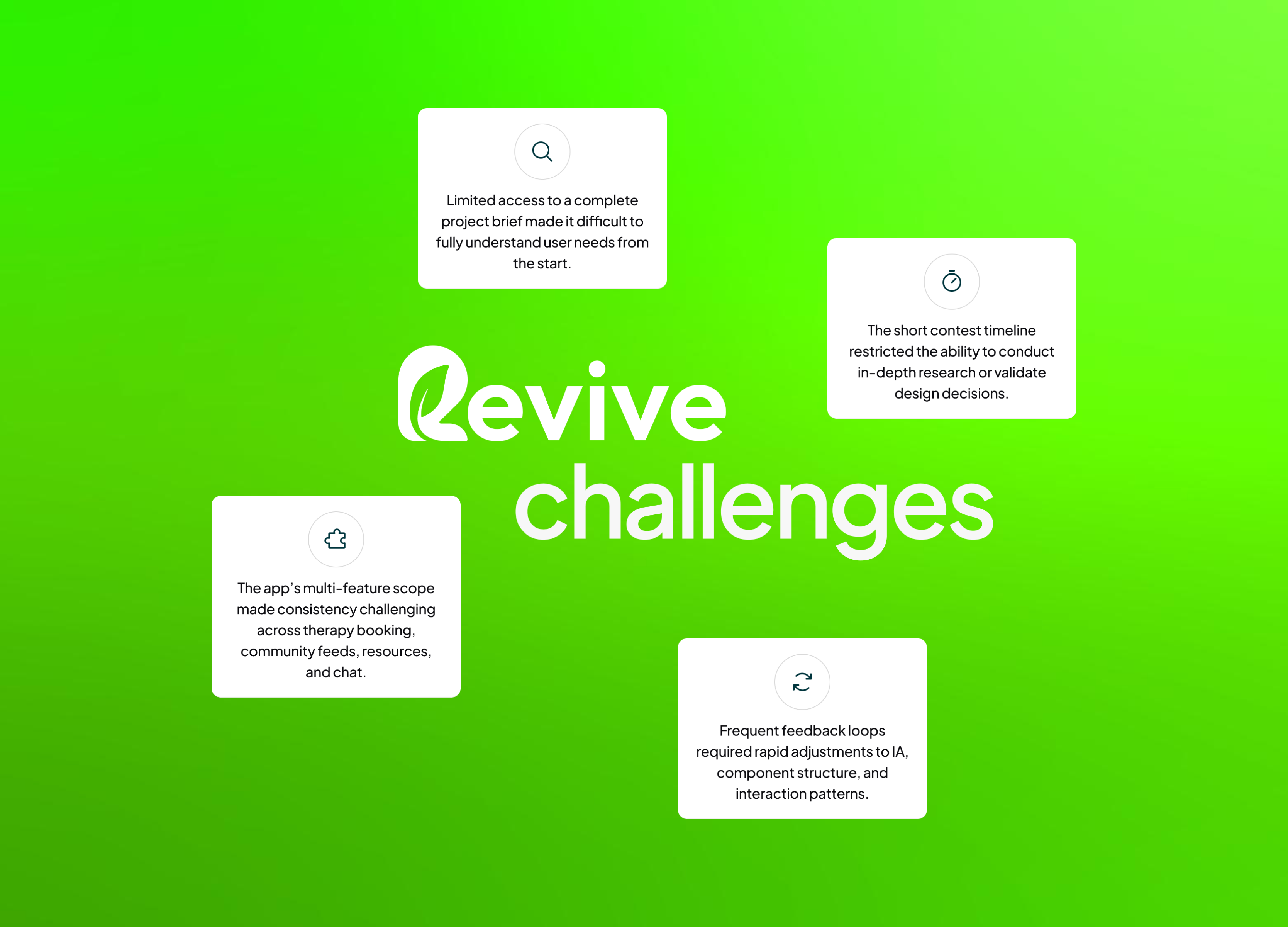
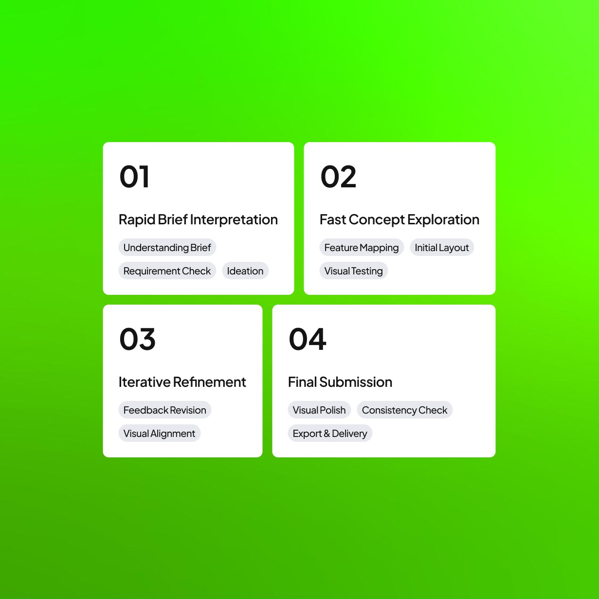
Designing within the structure of a 99designs contest created a fast and highly adaptive workflow. With only seven days and limited access to the full brief, there was little room for deep user research or formal UX testing. The process depended heavily on interpreting early requirements and responding quickly to client feedback, which shaped each iteration and helped clarify what mattered most. This constraint-driven environment required decisions that balanced speed, clarity, and intention.
Designing within the structure of a 99designs contest created a fast and highly adaptive workflow. With only seven days and limited access to the full brief, there was little room for deep user research or formal UX testing. The process depended heavily on interpreting early requirements and responding quickly to client feedback, which shaped each iteration and helped clarify what mattered most. This constraint-driven environment required decisions that balanced speed, clarity, and intention.
At its core, Revive focuses on human connection. Every interaction, visual, and flow was designed to make people feel understood, not analyzed and bringing a sense of calm to what’s often an anxious process.
At its core, Revive focuses on human connection. Every interaction, visual, and flow was designed to make people feel understood, not analyzed and bringing a sense of calm to what’s often an anxious process.
Design Proccess
Design Proccess
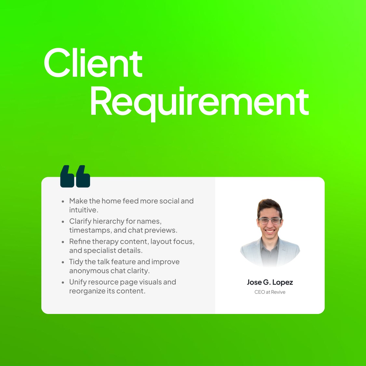
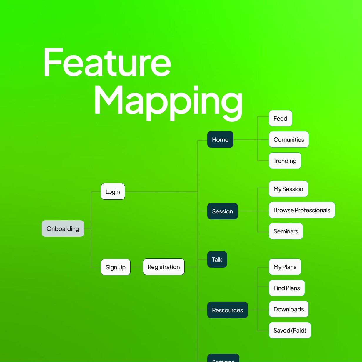
The design process began within the constraints of a short design contest, which limited the opportunity for deep research and full access to the initial brief. The early concept combined a community-style feed, therapy booking, anonymous chat, educational resources, and profile settings. With limited time, the focus was on interpreting the brief clearly and responding quickly to client feedback to maintain direction and ensure that the product felt relevant and practical.
The design process began within the constraints of a short design contest, which limited the opportunity for deep research and full access to the initial brief. The early concept combined a community-style feed, therapy booking, anonymous chat, educational resources, and profile settings. With limited time, the focus was on interpreting the brief clearly and responding quickly to client feedback to maintain direction and ensure that the product felt relevant and practical.
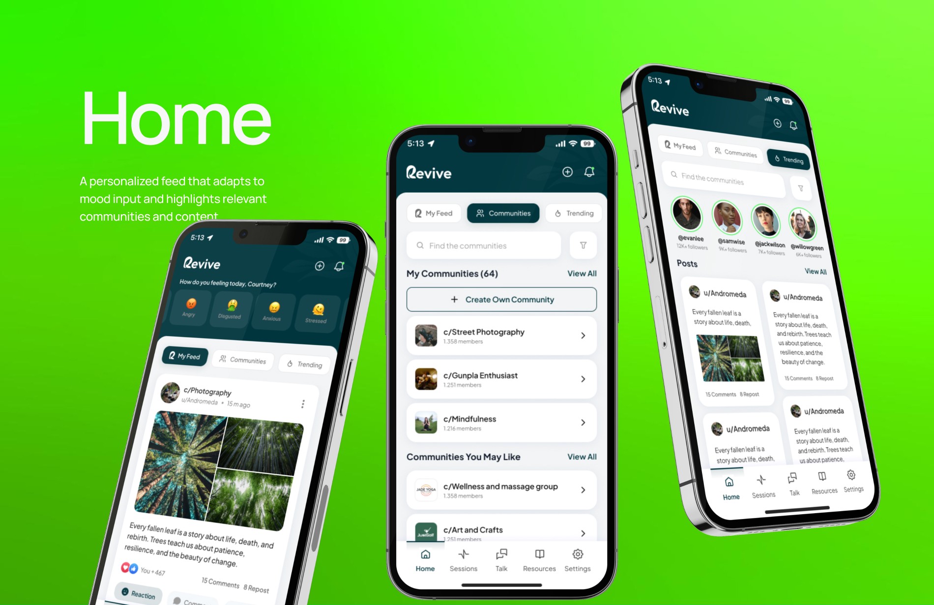
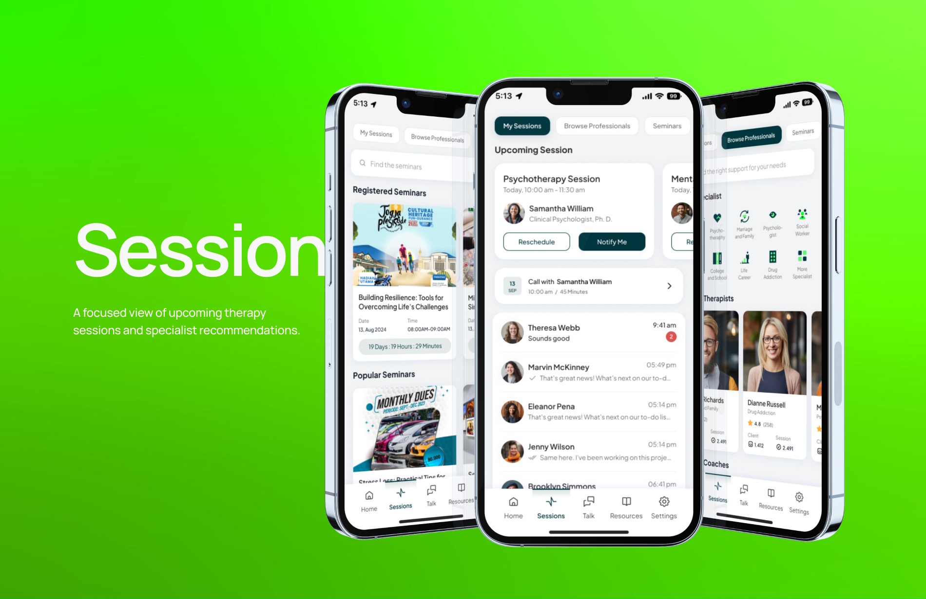
Iteration continued through regular feedback at every stage. Key improvements included turning the search bar into a more engaging prompt, simplifying feed tabs into My Feed, Community, and Trending, and improving chat visibility with usernames and previews. The therapy section was reorganized into My Therapist and Seminars, while the resource page gained filters and a white background for better readability. In the final phase, the Shorts section and prompt button were removed to reduce clutter, a plus icon was added for quick content creation, and therapist ratings were emphasized to strengthen trust. Consistent colors and UI components were maintained to ensure a cohesive experience.
Iteration continued through regular feedback at every stage. Key improvements included turning the search bar into a more engaging prompt, simplifying feed tabs into My Feed, Community, and Trending, and improving chat visibility with usernames and previews. The therapy section was reorganized into My Therapist and Seminars, while the resource page gained filters and a white background for better readability. In the final phase, the Shorts section and prompt button were removed to reduce clutter, a plus icon was added for quick content creation, and therapist ratings were emphasized to strengthen trust. Consistent colors and UI components were maintained to ensure a cohesive experience.
Outcome
Outcome
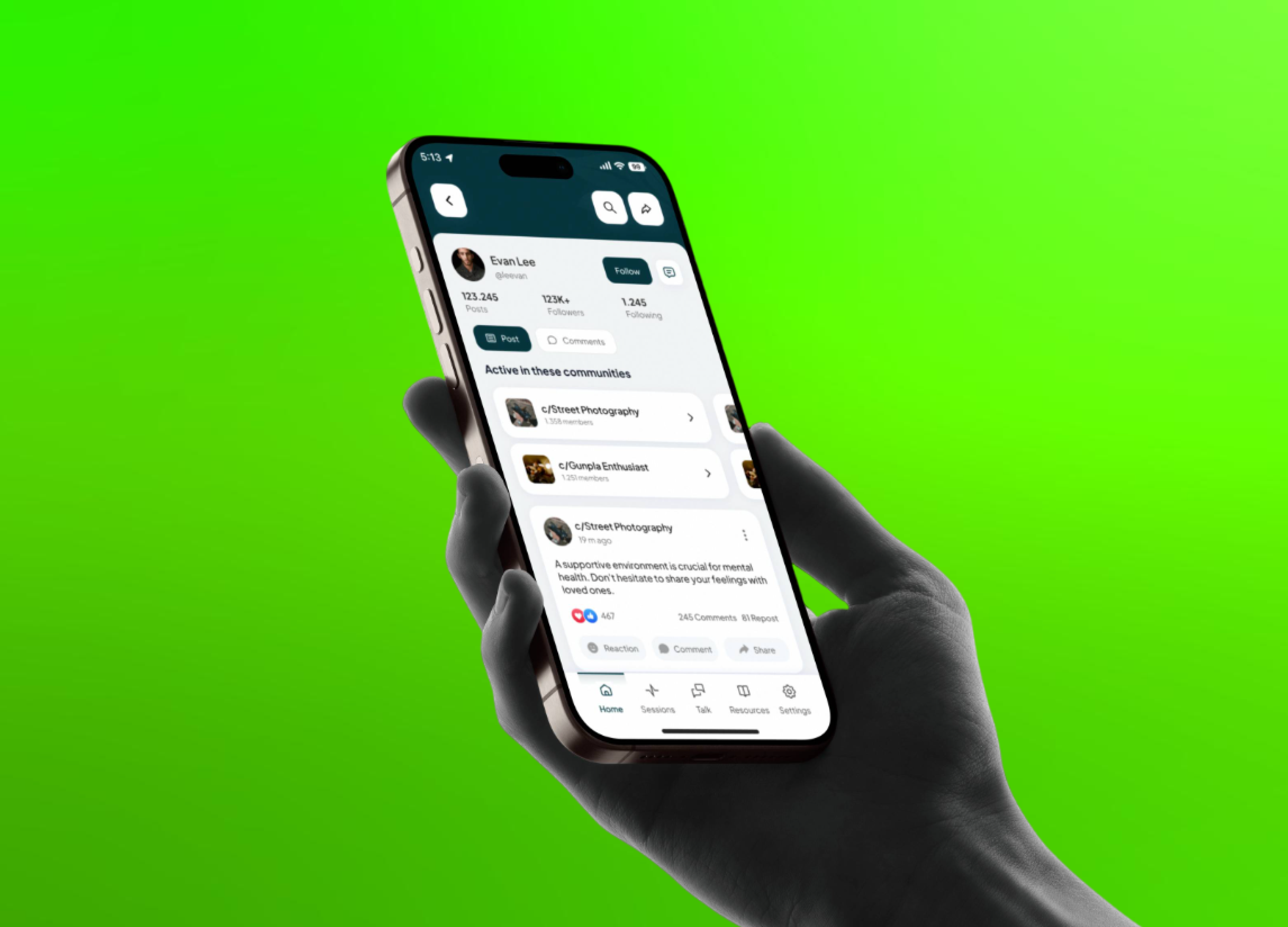
The final interface feels intuitive and personal. Navigation flows naturally, while key actions are presented clearly and without friction. The tone of voice, visuals, and interaction patterns all work together to create a space where users can focus on getting help rather than learning how to use the product.
The final interface feels intuitive and personal. Navigation flows naturally, while key actions are presented clearly and without friction. The tone of voice, visuals, and interaction patterns all work together to create a space where users can focus on getting help rather than learning how to use the product.
Beyond usability, the experience encourages consistency in engagement. Users are more likely to return and continue their progress, proving that design can play a meaningful role in emotional well-being when done with empathy and intention.
Beyond usability, the experience encourages consistency in engagement. Users are more likely to return and continue their progress, proving that design can play a meaningful role in emotional well-being when done with empathy and intention.
Impact
Impact
The final design streamlined how users access mental health support by bringing together key features such as community feeds, therapy booking, and educational resources in one cohesive flow. Feedback from the client and participants indicated that the experience felt more welcoming and easier to navigate, helping users feel confident when seeking help.
The final design streamlined how users access mental health support by bringing together key features such as community feeds, therapy booking, and educational resources in one cohesive flow. Feedback from the client and participants indicated that the experience felt more welcoming and easier to navigate, helping users feel confident when seeking help.
Although no quantitative testing was conducted, qualitative feedback revealed improvements in clarity and emotional comfort. This demonstrated how a design grounded in empathy and simplicity can enhance user trust and engagement, especially in sensitive contexts like mental health support.
Although no quantitative testing was conducted, qualitative feedback revealed improvements in clarity and emotional comfort. This demonstrated how a design grounded in empathy and simplicity can enhance user trust and engagement, especially in sensitive contexts like mental health support.
Reflection
Reflection
This project highlighted the importance of designing with empathy under time and data constraints. Working within a competitive setting required fast yet thoughtful responses to client feedback, ensuring every iteration aligned with user needs and emotional intent.
This project highlighted the importance of designing with empathy under time and data constraints. Working within a competitive setting required fast yet thoughtful responses to client feedback, ensuring every iteration aligned with user needs and emotional intent.
It also reinforced that design impact is often measured through perception rather than metrics. True validation came from how users felt—safe, guided, and understood. When clarity and emotion work hand in hand, the result goes beyond functionality to create an experience that truly supports and connects.
It also reinforced that design impact is often measured through perception rather than metrics. True validation came from how users felt—safe, guided, and understood. When clarity and emotion work hand in hand, the result goes beyond functionality to create an experience that truly supports and connects.