Dashboard
Dashboard
Data Visualization
Data Visualization
Decision Support
Decision Support
Enabling Strategic Decisions Through Comprehensive Political Intelligence
Enabling Strategic Decisions Through Comprehensive Political Intelligence
Enabling Strategic Decisions Through Comprehensive Political Intelligence
Project Timeline
2024
2024
Industry
Political Data
Political Data
Client
Government Institution
Government Institution
Bringing clarity to political information by organizing fragmented data into a structure that makes every issue easier to understand
Bringing clarity to political information by organizing fragmented data into a structure that makes every issue easier to understand
Political narratives shift faster than ever, and understanding them requires turning noise into knowledge. This project reimagines how analysts and decision-makers interpret digital conversations, transforming unstructured data into a clear and actionable intelligence system.
Political narratives shift faster than ever, and understanding them requires turning noise into knowledge. This project reimagines how analysts and decision-makers interpret digital conversations, transforming unstructured data into a clear and actionable intelligence system.
The goal was to enable users to monitor issue dynamics, sentiment trends, and media behavior within a single cohesive platform. The design emphasizes clarity, structure, and scalability to support strategic thinking at every level while maintaining visual harmony across complex datasets.
The goal was to enable users to monitor issue dynamics, sentiment trends, and media behavior within a single cohesive platform. The design emphasizes clarity, structure, and scalability to support strategic thinking at every level while maintaining visual harmony across complex datasets.


Challenge & Approach
Challenge & Approach
This project began with a fundamental gap in how political intelligence was being monitored. Critical updates from news, social media, and stakeholders were scattered across multiple sources, leaving analysts without a unified way to track issue growth, sentiment shifts, or emerging risks. Without a structured system, insights were often delayed, patterns were hard to detect, and decision-makers lacked a clear picture of what truly mattered in real time.
This project began with a fundamental gap in how political intelligence was being monitored. Critical updates from news, social media, and stakeholders were scattered across multiple sources, leaving analysts without a unified way to track issue growth, sentiment shifts, or emerging risks. Without a structured system, insights were often delayed, patterns were hard to detect, and decision-makers lacked a clear picture of what truly mattered in real time.
The goal was to enable users to monitor issue dynamics, sentiment trends, and media behavior within a single cohesive platform. The design emphasizes clarity, structure, and scalability to support strategic thinking at every level while maintaining visual harmony across complex datasets.
The goal was to enable users to monitor issue dynamics, sentiment trends, and media behavior within a single cohesive platform. The design emphasizes clarity, structure, and scalability to support strategic thinking at every level while maintaining visual harmony across complex datasets.


Design Proccess
Design Proccess
The design process began with a comprehensive understanding of how political analysts interact with data. Collaboration with the data science team helped map the workflow from data collection to insight generation, revealing pain points such as scattered visuals, inconsistent chart interpretations, and lack of contextual connections across issues.
The design process began with a comprehensive understanding of how political analysts interact with data. Collaboration with the data science team helped map the workflow from data collection to insight generation, revealing pain points such as scattered visuals, inconsistent chart interpretations, and lack of contextual connections across issues.
Based on these findings, the information architecture was structured around three key principles: hierarchy, clarity, and scalability. Data was organized by relevance to improve comprehension, consistent visual patterns were applied across all modules to strengthen familiarity, and a flexible layout system was built to support future expansion. Wireframes underwent internal reviews to ensure that each page encouraged both exploration and comparison without cognitive overload.
Based on these findings, the information architecture was structured around three key principles: hierarchy, clarity, and scalability. Data was organized by relevance to improve comprehension, consistent visual patterns were applied across all modules to strengthen familiarity, and a flexible layout system was built to support future expansion. Wireframes underwent internal reviews to ensure that each page encouraged both exploration and comparison without cognitive overload.


Outcome
Outcome
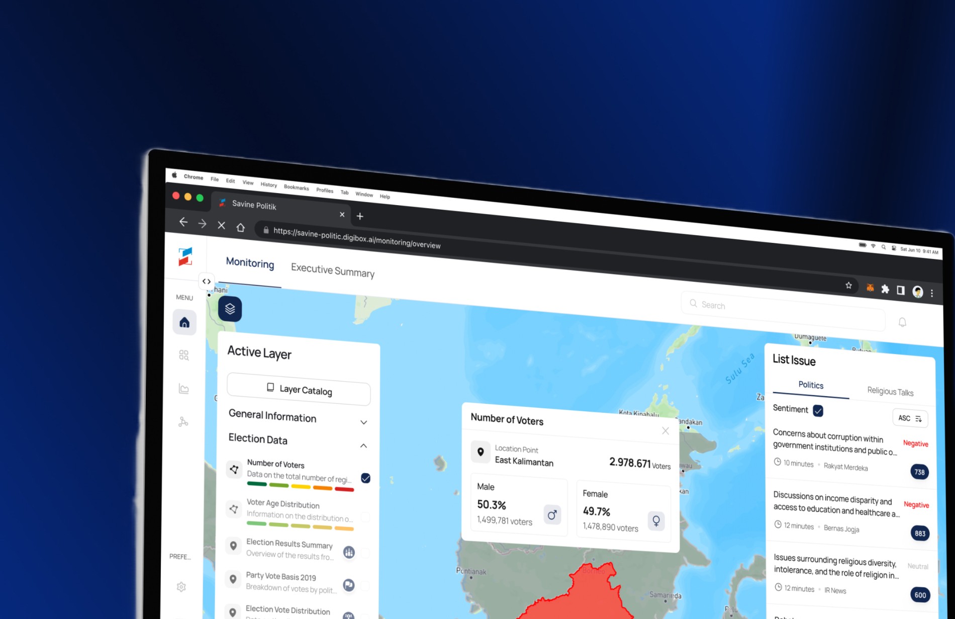
The final design delivers a unified analytics experience that transforms complexity into clarity. Each issue page follows a structured hierarchy: key metrics at the top, followed by sentiment trends, media distribution, and contextual highlights. The visual language balances analytical density and visual calmness through subtle depth, refined typography, and controlled use of color.
The final design delivers a unified analytics experience that transforms complexity into clarity. Each issue page follows a structured hierarchy: key metrics at the top, followed by sentiment trends, media distribution, and contextual highlights. The visual language balances analytical density and visual calmness through subtle depth, refined typography, and controlled use of color.
Charts and tables follow a standardized design system, ensuring consistency and quick interpretability. The interface not only visualizes data but communicates narrative flow, enabling users to read patterns and draw insights effortlessly. The result is an environment that feels both data-rich and approachable.
Charts and tables follow a standardized design system, ensuring consistency and quick interpretability. The interface not only visualizes data but communicates narrative flow, enabling users to read patterns and draw insights effortlessly. The result is an environment that feels both data-rich and approachable.


Impact
Impact
The implementation of this dashboard transformed how political and social data are analyzed. What once required manually checking multiple platforms is now consolidated into a single, unified interface that presents real-time insights and measurable trends. This integration makes complex information more accessible and actionable across teams.
The implementation of this dashboard transformed how political and social data are analyzed. What once required manually checking multiple platforms is now consolidated into a single, unified interface that presents real-time insights and measurable trends. This integration makes complex information more accessible and actionable across teams.
Beyond simplifying workflows, the dashboard has become a strategic tool that strengthens decision-making. It enables stakeholders to identify emerging issues faster, evaluate narratives more accurately, and align their responses with data-driven confidence.
Beyond simplifying workflows, the dashboard has become a strategic tool that strengthens decision-making. It enables stakeholders to identify emerging issues faster, evaluate narratives more accurately, and align their responses with data-driven confidence.

Reflection
Reflection
This project demonstrates how design can bring order and clarity to inherently complex information systems. The process highlighted the importance of hierarchy, consistency, and modularity when designing for analytical depth.
This project demonstrates how design can bring order and clarity to inherently complex information systems. The process highlighted the importance of hierarchy, consistency, and modularity when designing for analytical depth.
By transforming fragmented political data into an accessible interface, the project bridges the gap between information and understanding, turning complexity into strategic clarity.
By transforming fragmented political data into an accessible interface, the project bridges the gap between information and understanding, turning complexity into strategic clarity.