Mobile App
Mobile App
Information Design
Information Design
Resource Management
Resource Management
Optimizing Fertilizer Allocation through the E-Allocation Summary
Optimizing Fertilizer Allocation through the E-Allocation Summary
Optimizing Fertilizer Allocation through the E-Allocation Summary
Project Timeline
2023
2023
Industry
Agriculture
Agriculture
Client
Pupuk Indonesia
Pupuk Indonesia
Bringing Simplicity and Clear Structure to the Complex Landscape of Fertilizer Allocation Data
Bringing Simplicity and Clear Structure to the Complex Landscape of Fertilizer Allocation Data
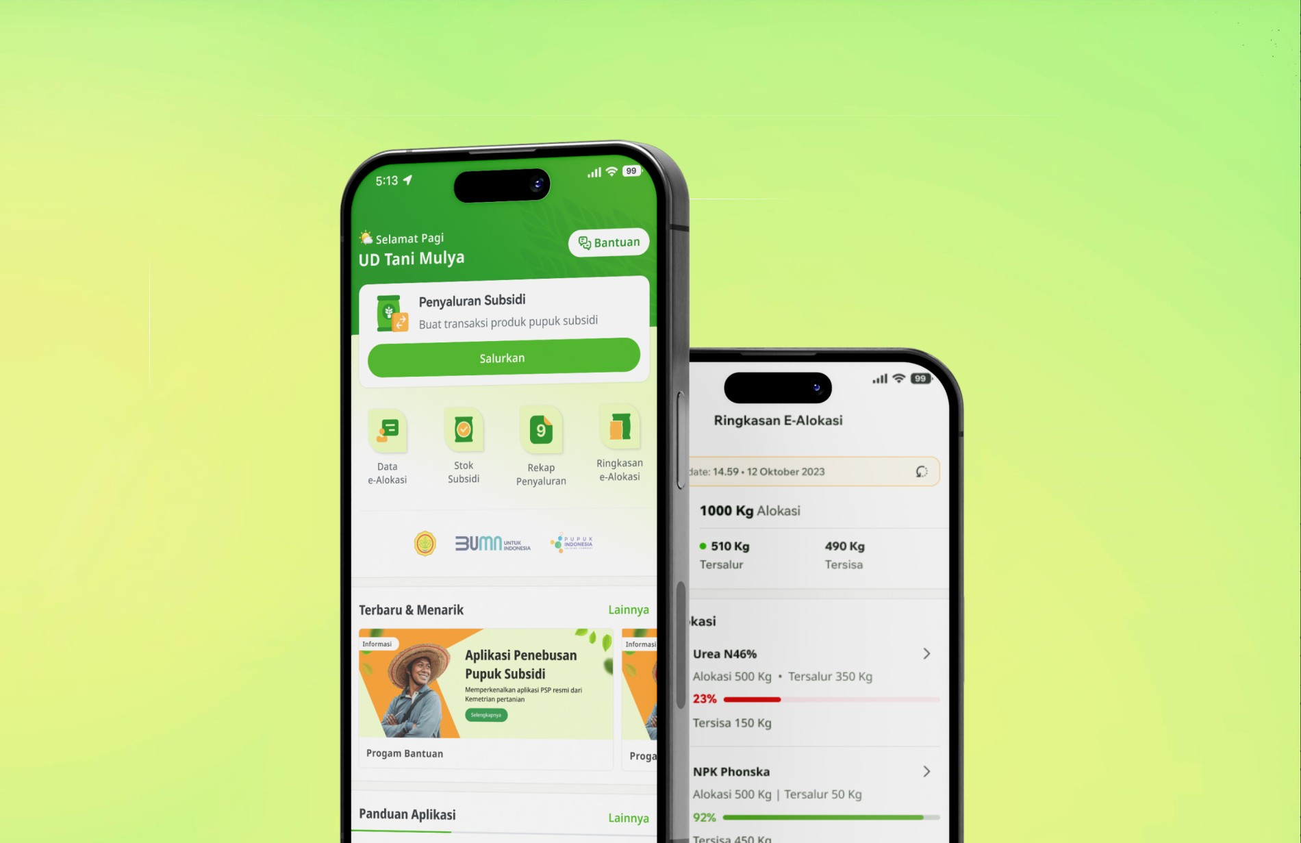
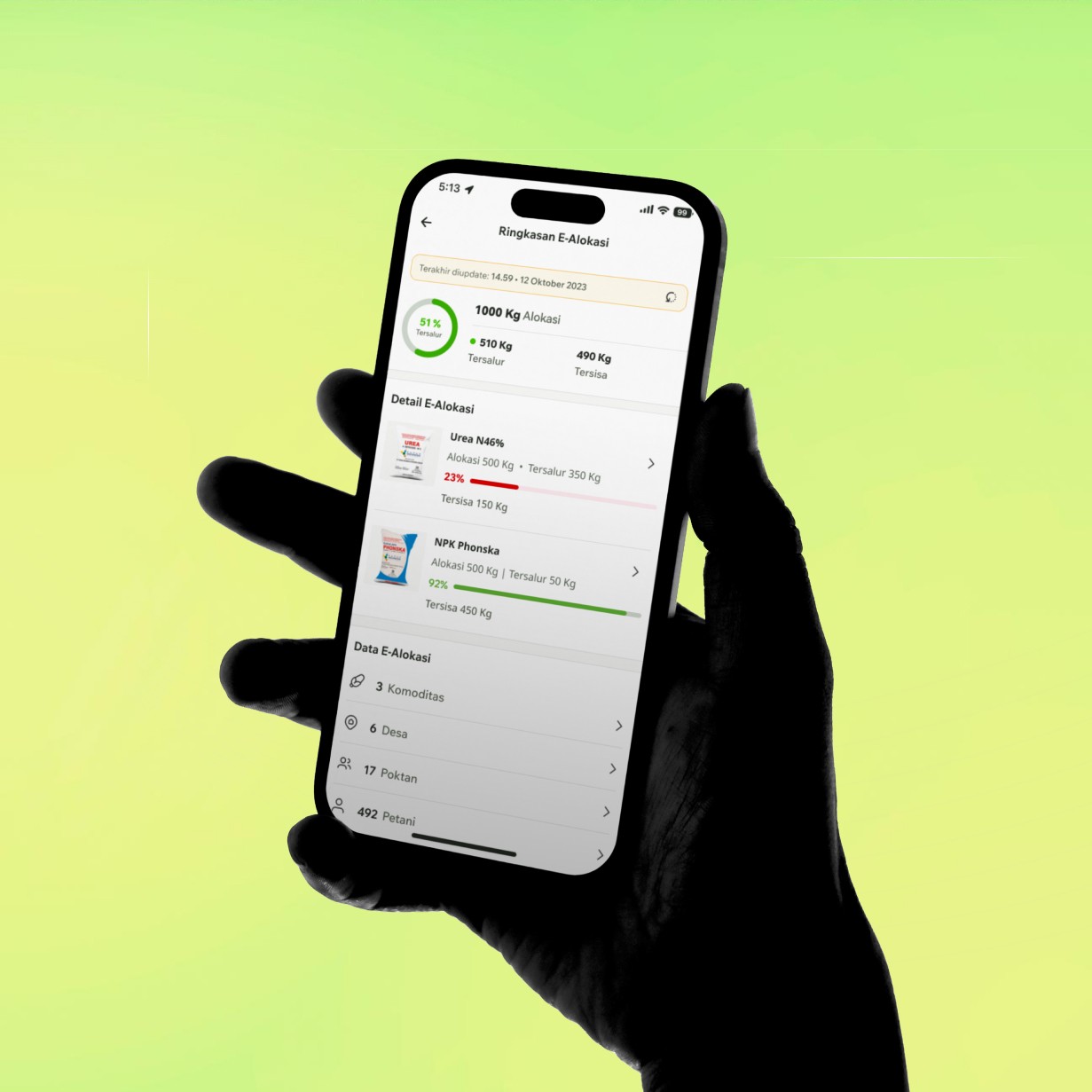
Managing subsidized fertilizer allocation isn’t just about displaying data—it’s about making sure kios, farmer groups, and individual farmers receive exactly what they’re entitled to, without delays or confusion. In practice, this information is often scattered, requiring multiple checks that slow down field operations and open room for errors.
Managing subsidized fertilizer allocation isn’t just about displaying data—it’s about making sure kios, farmer groups, and individual farmers receive exactly what they’re entitled to, without delays or confusion. In practice, this information is often scattered, requiring multiple checks that slow down field operations and open room for errors.
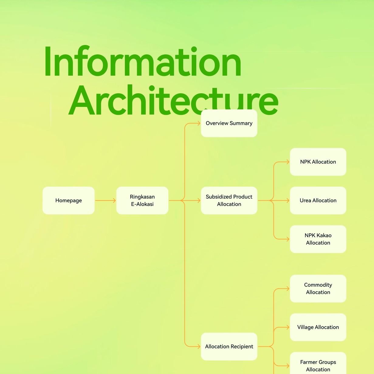
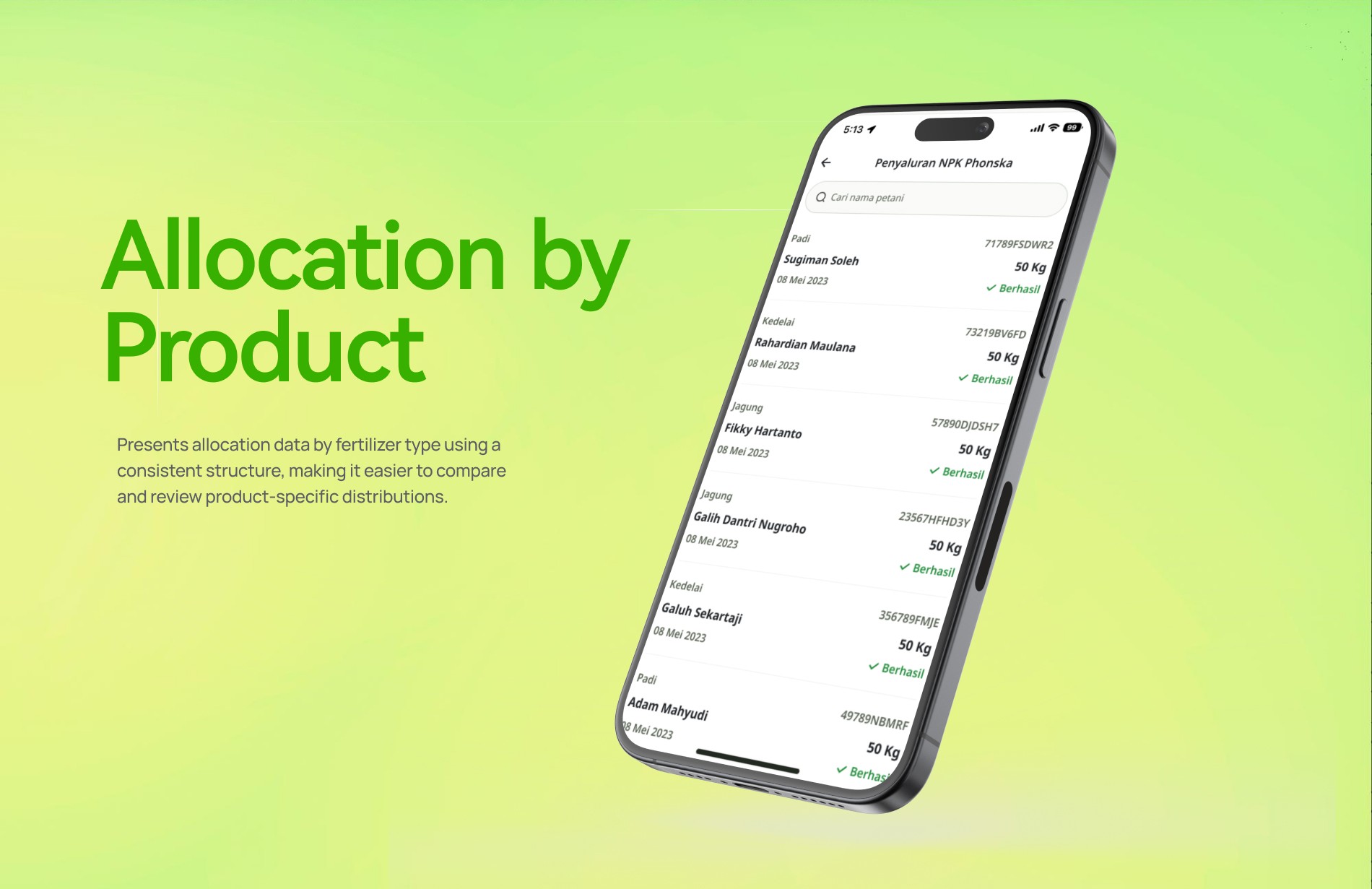
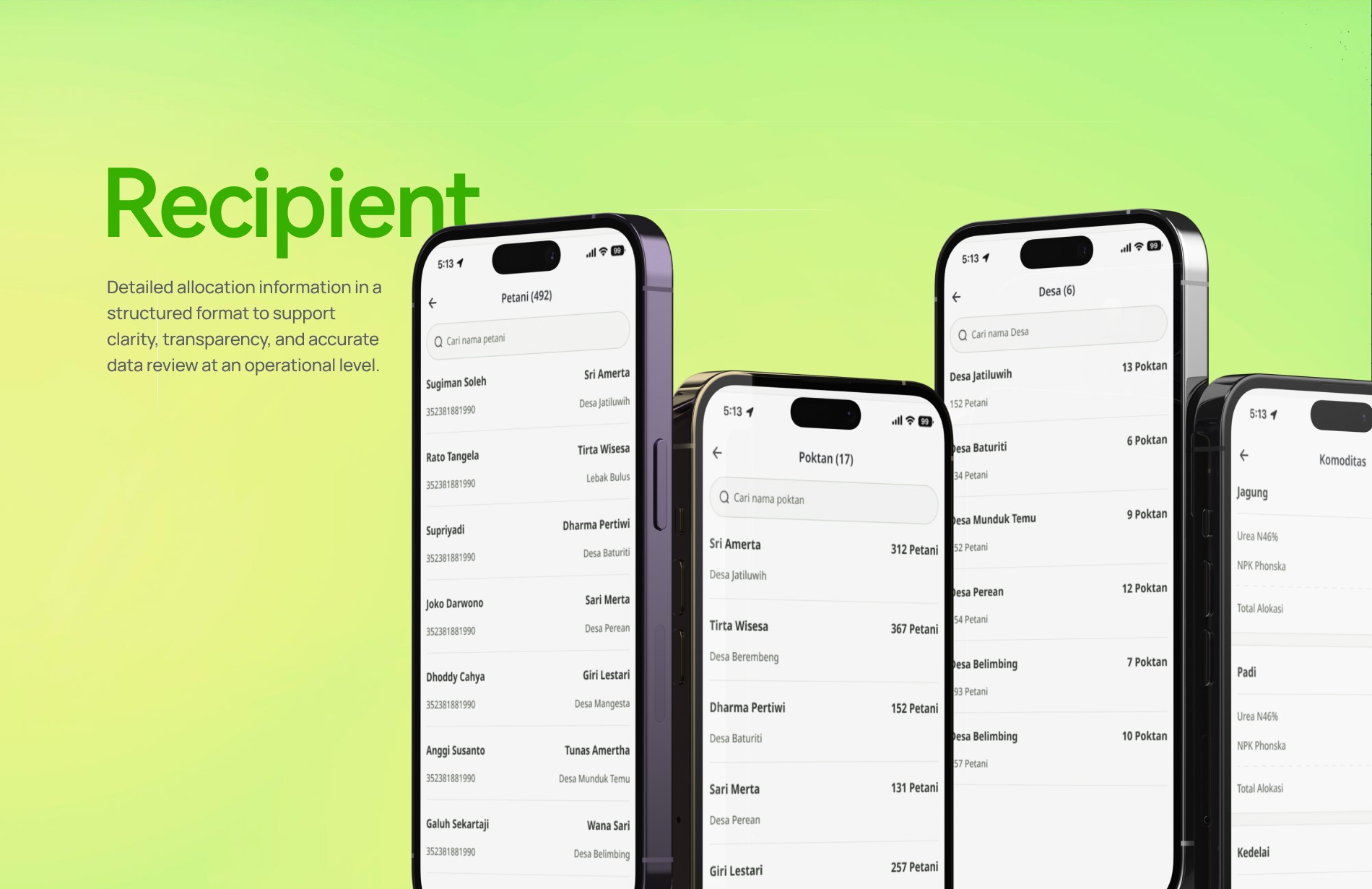
With this update, the goal was to present allocation details in a way that feels coherent and easy to follow. From commodity breakdowns to village-level distribution, farmer groups, and individual recipients, each layer was streamlined to help field officers trace information quickly while keeping full context. The result is a clearer, more intuitive experience that supports faster and more confident decision-making on the ground.
With this update, the goal was to present allocation details in a way that feels coherent and easy to follow. From commodity breakdowns to village-level distribution, farmer groups, and individual recipients, each layer was streamlined to help field officers trace information quickly while keeping full context. The result is a clearer, more intuitive experience that supports faster and more confident decision-making on the ground.
Challenge & Approach
Challenge & Approach
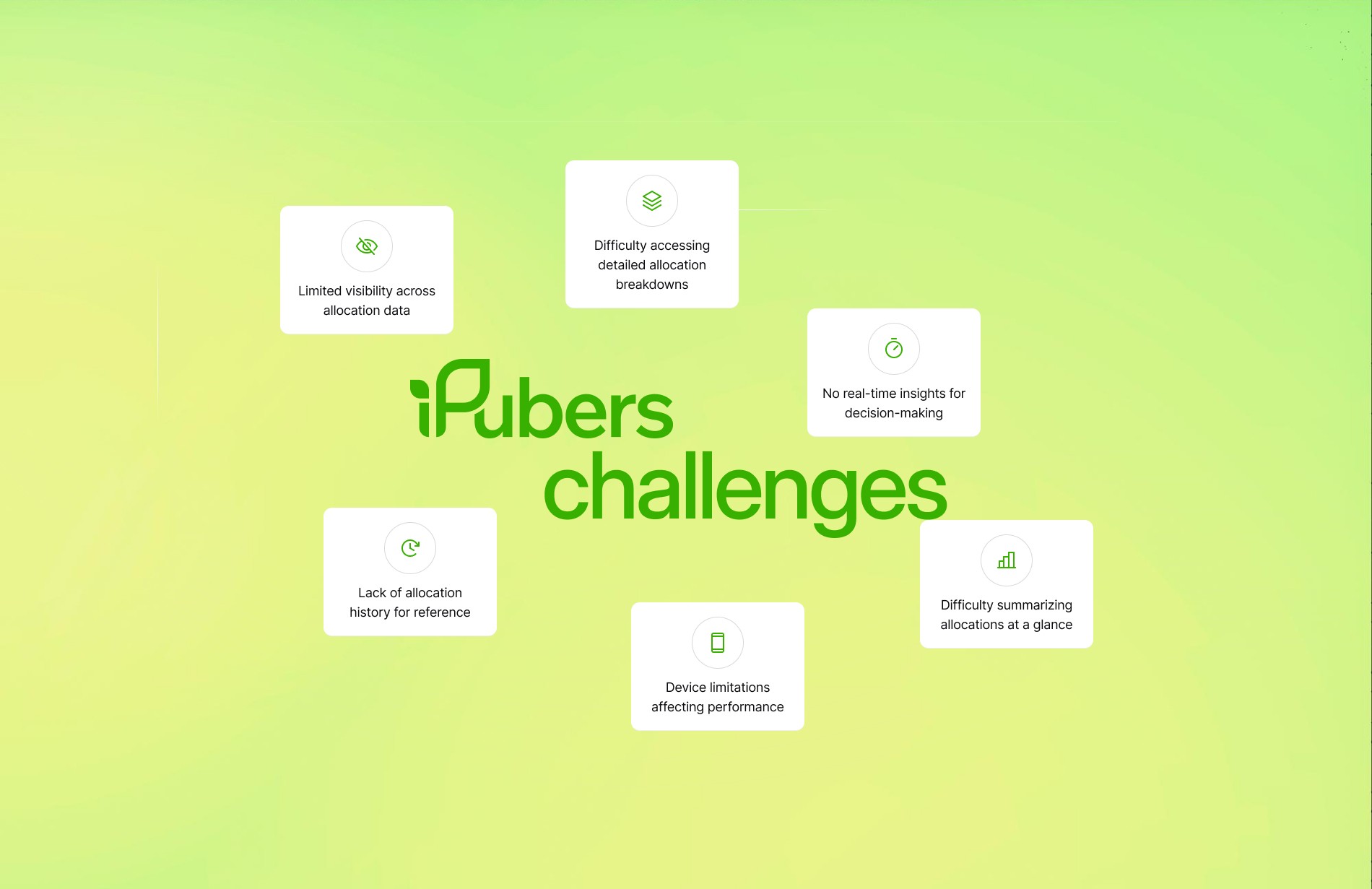
iPubers had long operated without a reliable, structured way to understand how subsidized fertilizer was being allocated across villages, farmer groups, and individual recipients. For Kios, this meant navigating scattered information, switching between disconnected sources, and relying on manual checks just to answer simple questions—often leading to delays, uncertainty, and unnecessary back-and-forth.
iPubers had long operated without a reliable, structured way to understand how subsidized fertilizer was being allocated across villages, farmer groups, and individual recipients. For Kios, this meant navigating scattered information, switching between disconnected sources, and relying on manual checks just to answer simple questions—often leading to delays, uncertainty, and unnecessary back-and-forth.
With this update, the goal was to present allocation details in a way that feels coherent and easy to follow. From commodity breakdowns to village-level distribution, farmer groups, and individual recipients, each layer was streamlined to help field officers trace information quickly while keeping full context. The result is a clearer, more intuitive experience that supports faster and more confident decision-making on the ground.
With this update, the goal was to present allocation details in a way that feels coherent and easy to follow. From commodity breakdowns to village-level distribution, farmer groups, and individual recipients, each layer was streamlined to help field officers trace information quickly while keeping full context. The result is a clearer, more intuitive experience that supports faster and more confident decision-making on the ground.

Design Proccess
Design Proccess
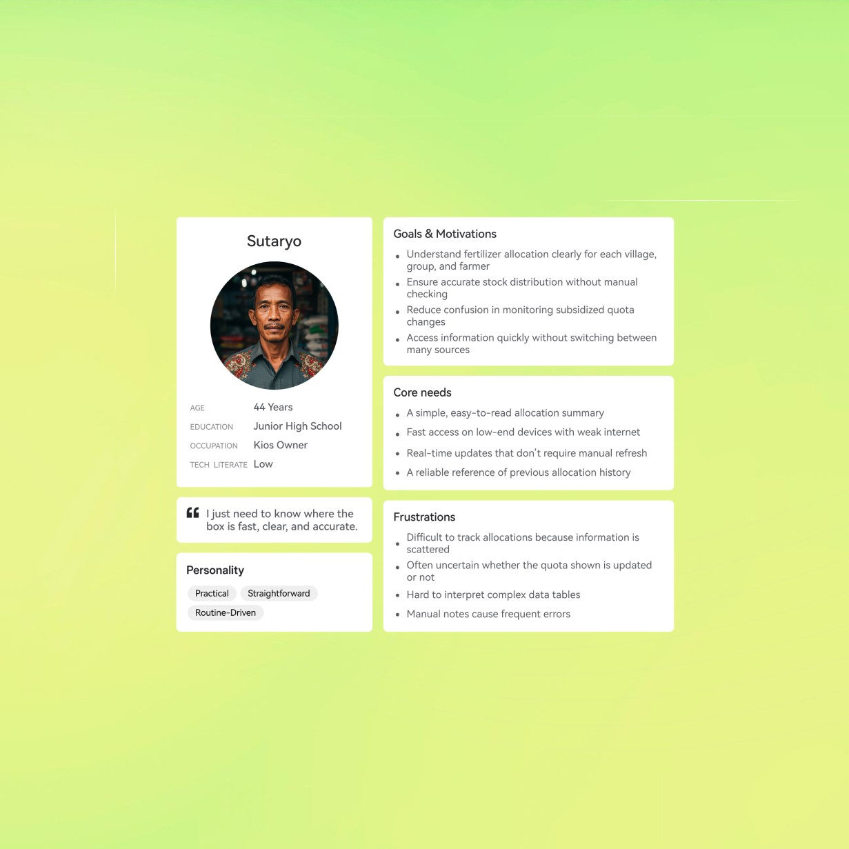
The process started with understanding the problem from the ground up, even though several limitations shaped how the project could take form. Without the chance to run direct user research, the most reliable sources of insight came from discussions with stakeholders at the Ministry of Agriculture and the Digitalisasi Pemasaran team. Combined with behavior patterns and existing data from the Business Analyst team, these inputs helped form a clear picture of what users needed. Despite relying on secondary research, the information was solid enough to guide early decisions and keep the direction focused.
The process started with understanding the problem from the ground up, even though several limitations shaped how the project could take form. Without the chance to run direct user research, the most reliable sources of insight came from discussions with stakeholders at the Ministry of Agriculture and the Digitalisasi Pemasaran team. Combined with behavior patterns and existing data from the Business Analyst team, these inputs helped form a clear picture of what users needed. Despite relying on secondary research, the information was solid enough to guide early decisions and keep the direction focused.
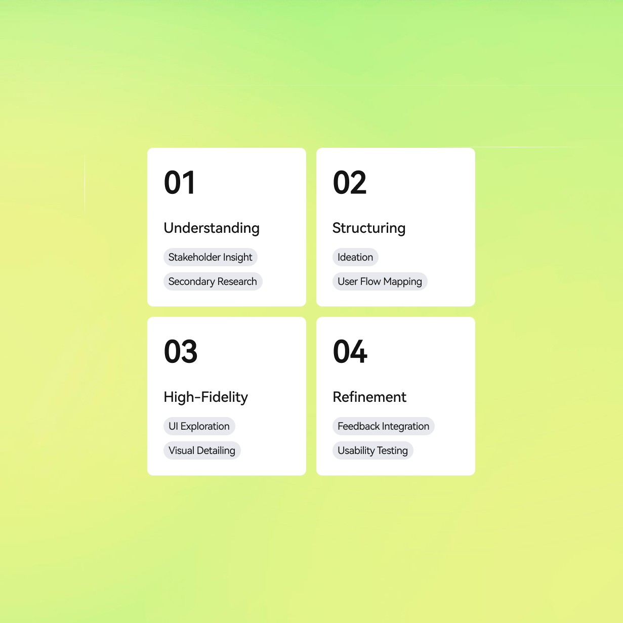
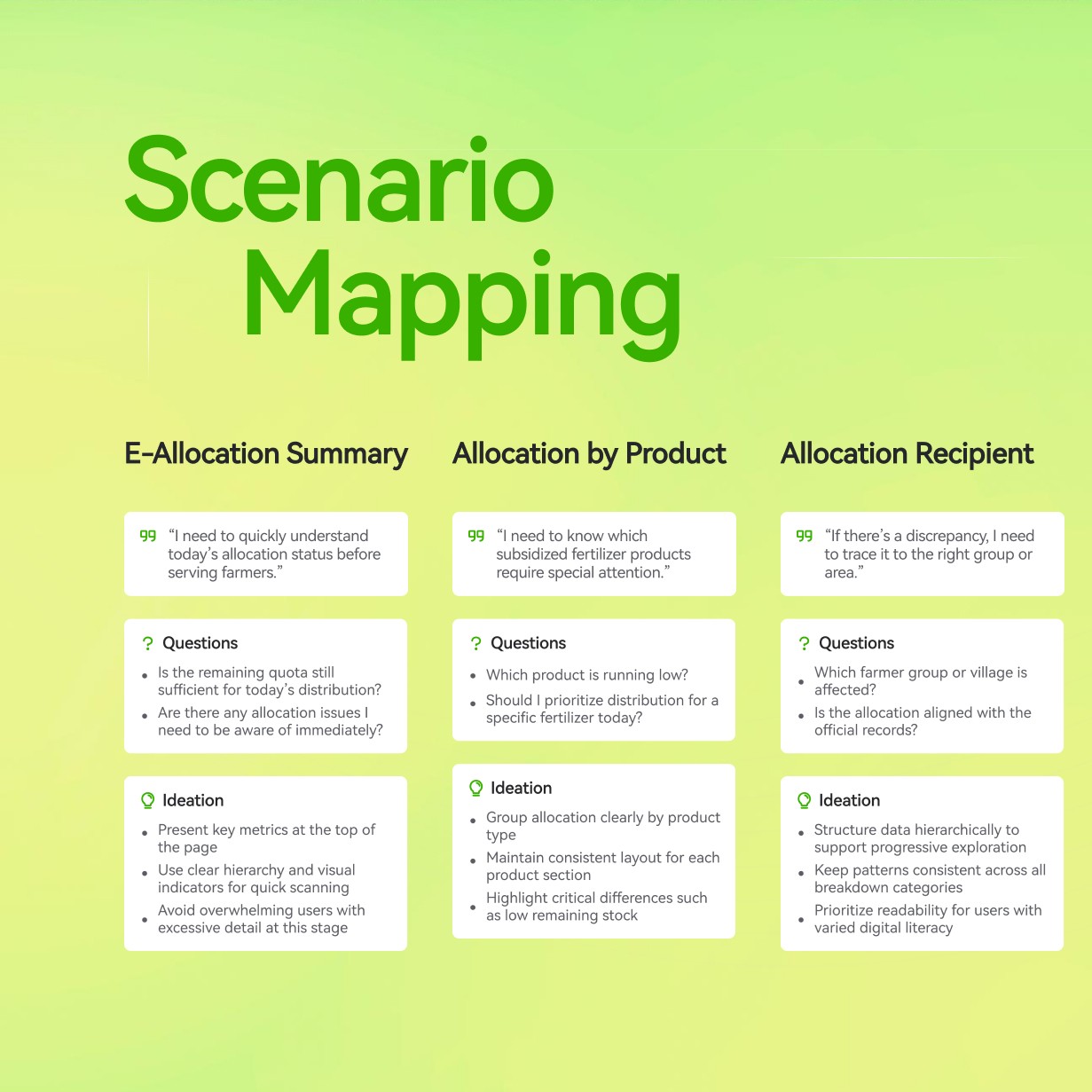
With tight timelines, the workflow naturally shifted to a more agile rhythm. Decisions needed to be made quickly, ideas had to evolve fast, and the design approach remained flexible throughout the process. Instead of building detailed personas, the focus stayed on shaping solutions that could adapt to different user conditions. From these insights, early concepts were developed and gradually translated into user flows that mapped out how Kios would explore allocation details. The goal was to keep everything straightforward and intuitive, making the experience easy to follow even as the information became more layered.
With tight timelines, the workflow naturally shifted to a more agile rhythm. Decisions needed to be made quickly, ideas had to evolve fast, and the design approach remained flexible throughout the process. Instead of building detailed personas, the focus stayed on shaping solutions that could adapt to different user conditions. From these insights, early concepts were developed and gradually translated into user flows that mapped out how Kios would explore allocation details. The goal was to keep everything straightforward and intuitive, making the experience easy to follow even as the information became more layered.
Outcome
Outcome
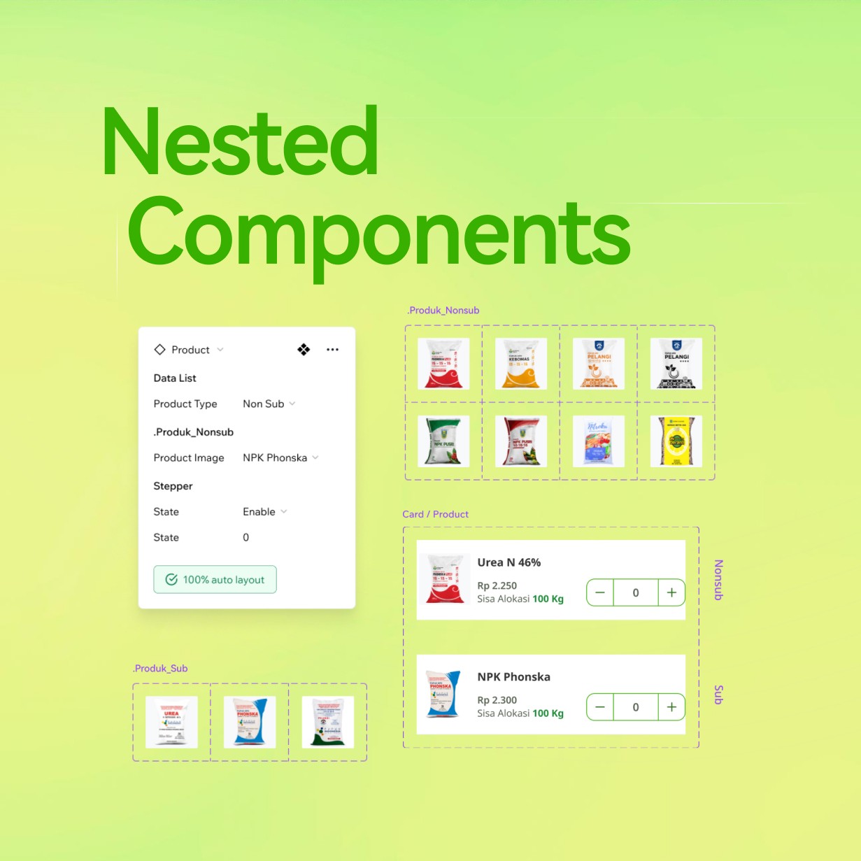
Moving from user flows directly into high-fidelity designs allowed the project to move quickly without losing clarity. Since the target users were already familiar with iPubers’ existing patterns, the design leaned on established visual structures to reduce friction and learning time. Skipping wireframes made the process more efficient, keeping the focus on crafting interfaces that felt refined, intuitive, and aligned with how users already navigate the app.
Moving from user flows directly into high-fidelity designs allowed the project to move quickly without losing clarity. Since the target users were already familiar with iPubers’ existing patterns, the design leaned on established visual structures to reduce friction and learning time. Skipping wireframes made the process more efficient, keeping the focus on crafting interfaces that felt refined, intuitive, and aligned with how users already navigate the app.
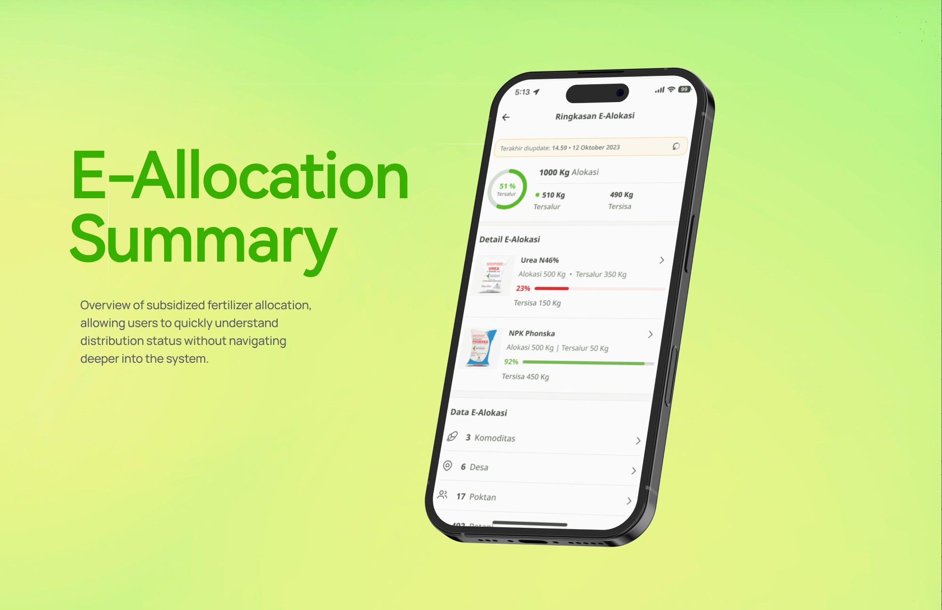
As the visuals developed, a small round of feedback highlighted the need to adjust how total fertilizer allocation was presented. The semi-circular chart used in the early design was replaced with a radial chart to create a clearer point of reference and improve readability. The radial layout provided a more intuitive way for users to interpret allocation proportions, helping the information feel more direct and easier to understand.
As the visuals developed, a small round of feedback highlighted the need to adjust how total fertilizer allocation was presented. The semi-circular chart used in the early design was replaced with a radial chart to create a clearer point of reference and improve readability. The radial layout provided a more intuitive way for users to interpret allocation proportions, helping the information feel more direct and easier to understand.

Impact
Impact
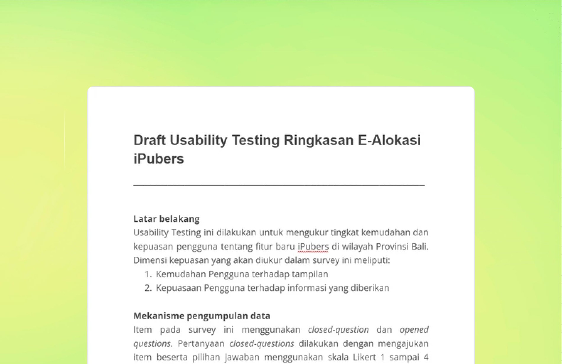
To understand how well the new feature aligned with kiosk users’ expectations, unmoderated usability testing was carried out through a questionnaire distributed with assistance from the business analyst team. The questions focused on two areas: how clearly users interpreted the interface and how satisfied they were with the allocation information presented. The responses were rated on a scale of one to four, offering a practical way to measure their impressions.
To understand how well the new feature aligned with kiosk users’ expectations, unmoderated usability testing was carried out through a questionnaire distributed with assistance from the business analyst team. The questions focused on two areas: how clearly users interpreted the interface and how satisfied they were with the allocation information presented. The responses were rated on a scale of one to four, offering a practical way to measure their impressions.
Results showed an average score of 2.97 for interface comprehension and 2.6 for information satisfaction. While the scores indicate that users were generally able to understand how the feature worked, they also highlight opportunities for refinement. These insights provided a clearer sense of how the feature performed in real conditions and which parts could evolve further, serving as a valuable foundation for the next phase of improvements.
Results showed an average score of 2.97 for interface comprehension and 2.6 for information satisfaction. While the scores indicate that users were generally able to understand how the feature worked, they also highlight opportunities for refinement. These insights provided a clearer sense of how the feature performed in real conditions and which parts could evolve further, serving as a valuable foundation for the next phase of improvements.
Reflection
Reflection
This project highlighted the balancing act between stakeholder expectations, limited timelines, and the need to create solutions grounded in actual user behavior. With no direct user research at the start, market insights and analytics became essential in guiding the design direction. Even so, the outcome reinforced how valuable direct user input is when the goal is to build features that genuinely match users’ needs and workflows.
This project highlighted the balancing act between stakeholder expectations, limited timelines, and the need to create solutions grounded in actual user behavior. With no direct user research at the start, market insights and analytics became essential in guiding the design direction. Even so, the outcome reinforced how valuable direct user input is when the goal is to build features that genuinely match users’ needs and workflows.
The design process became a collaborative effort, shaped by ongoing discussions, small iterations, and the shared goal of refining the experience. Moving forward, the focus remains on continuous improvement driven by user feedback, ensuring future iterations bridge the gap between stakeholder goals and everyday realities at the kiosks.
The design process became a collaborative effort, shaped by ongoing discussions, small iterations, and the shared goal of refining the experience. Moving forward, the focus remains on continuous improvement driven by user feedback, ensuring future iterations bridge the gap between stakeholder goals and everyday realities at the kiosks.